
When tasked with creating a showcase project, I jumped at the perfect opportunity to mock up a theoretical brand. This has been something I have wanted to pursue to some extent for years. This project allowed me to tackle parts of the whole process, creating branding from the ground up, designing products, building and creating the tangible products, and pulling it all together with a website to theoretically sell from. Coast to Coast allowed me to showcase my passion for not only design, but for making the designs come to life. Building the skateboards and printing the shirts for this project was just as enjoyable as digitally drawing the logos, posters, and stickers. This was an exciting project, propelling me into planning how I wish to grow my own business.
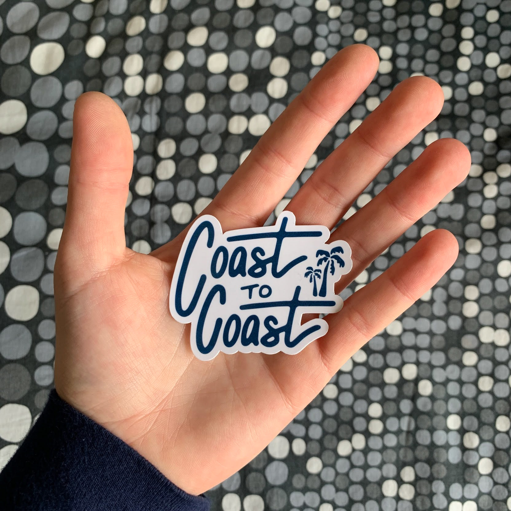
The Coast to Coast Story
Q: How might we promote the feeling of freedom that comes from casually cruising down the street on a skateboard while also promoting the feeling of fulfillment that comes from giving back to organizations protecting our environment?
A: Create a skate company that takes pride in giving back to the world we live in with the hopes of preserving our country’s natural beauty and treasures
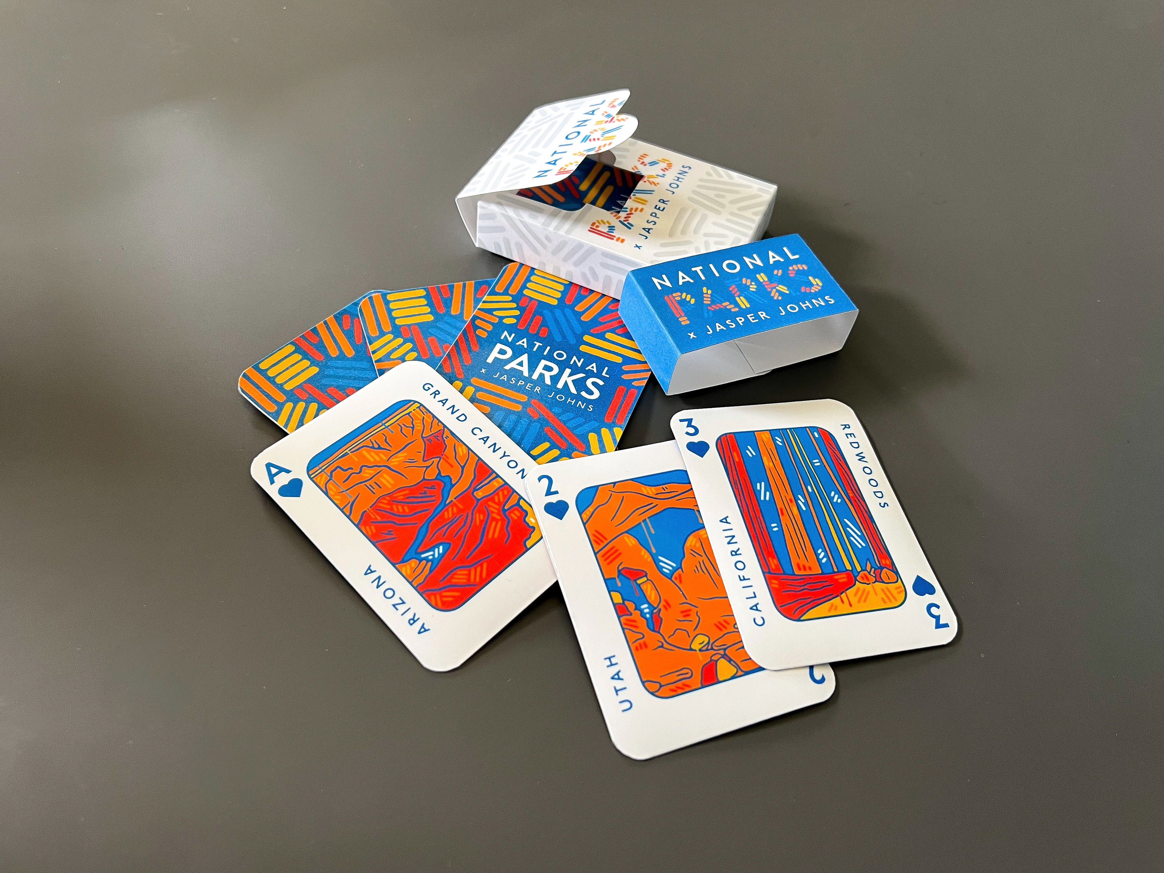
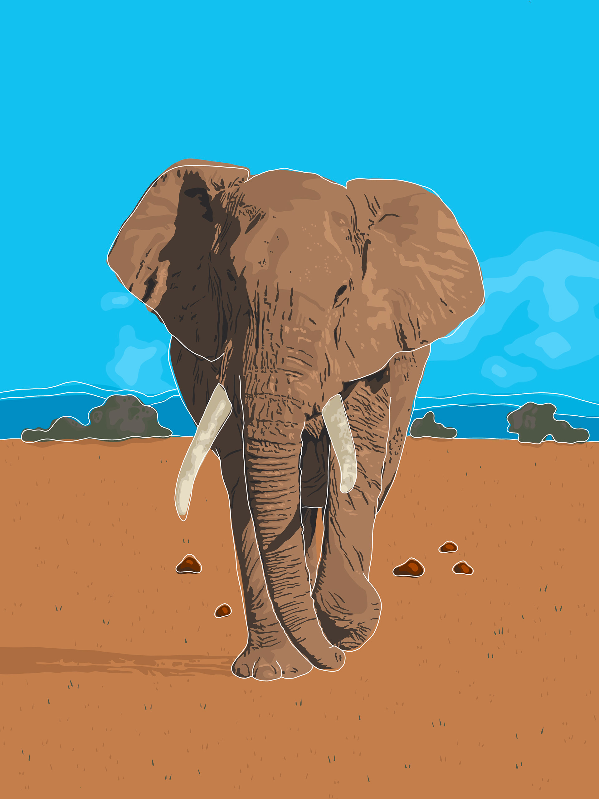
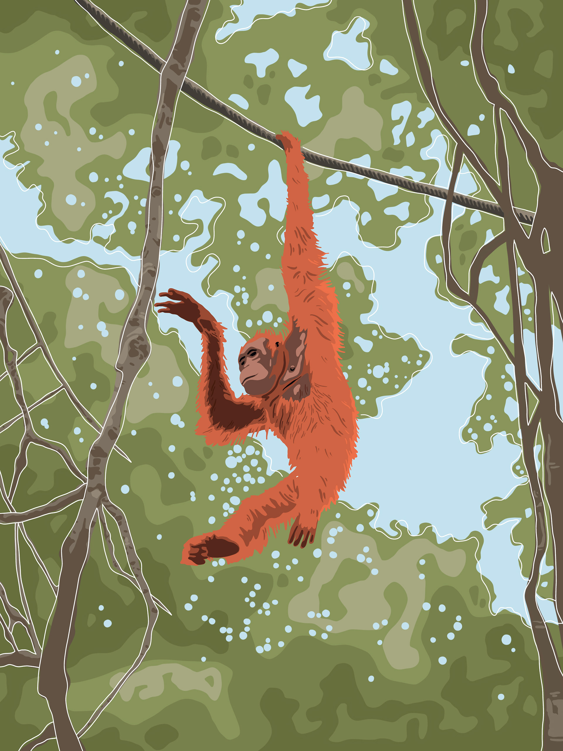
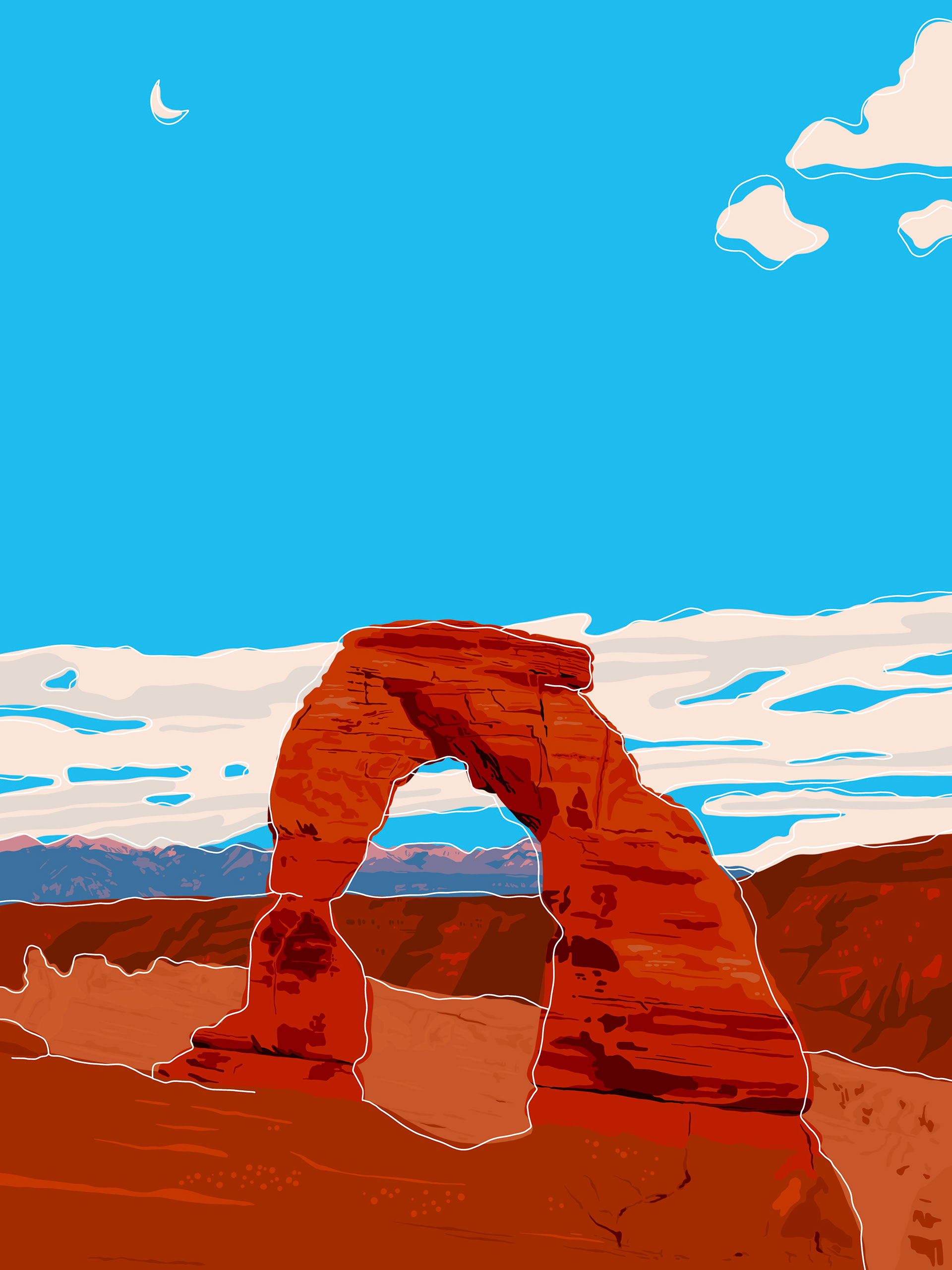
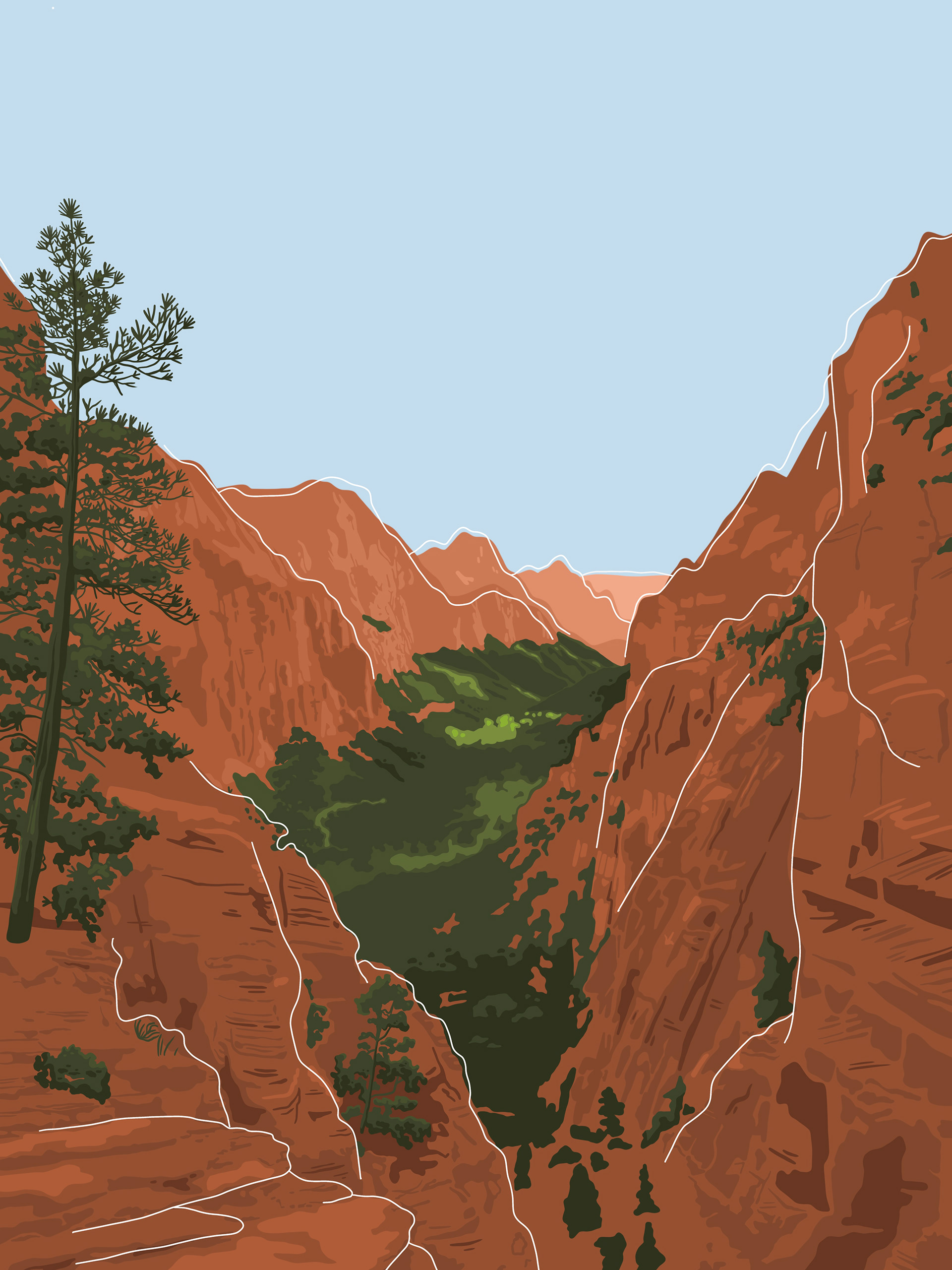
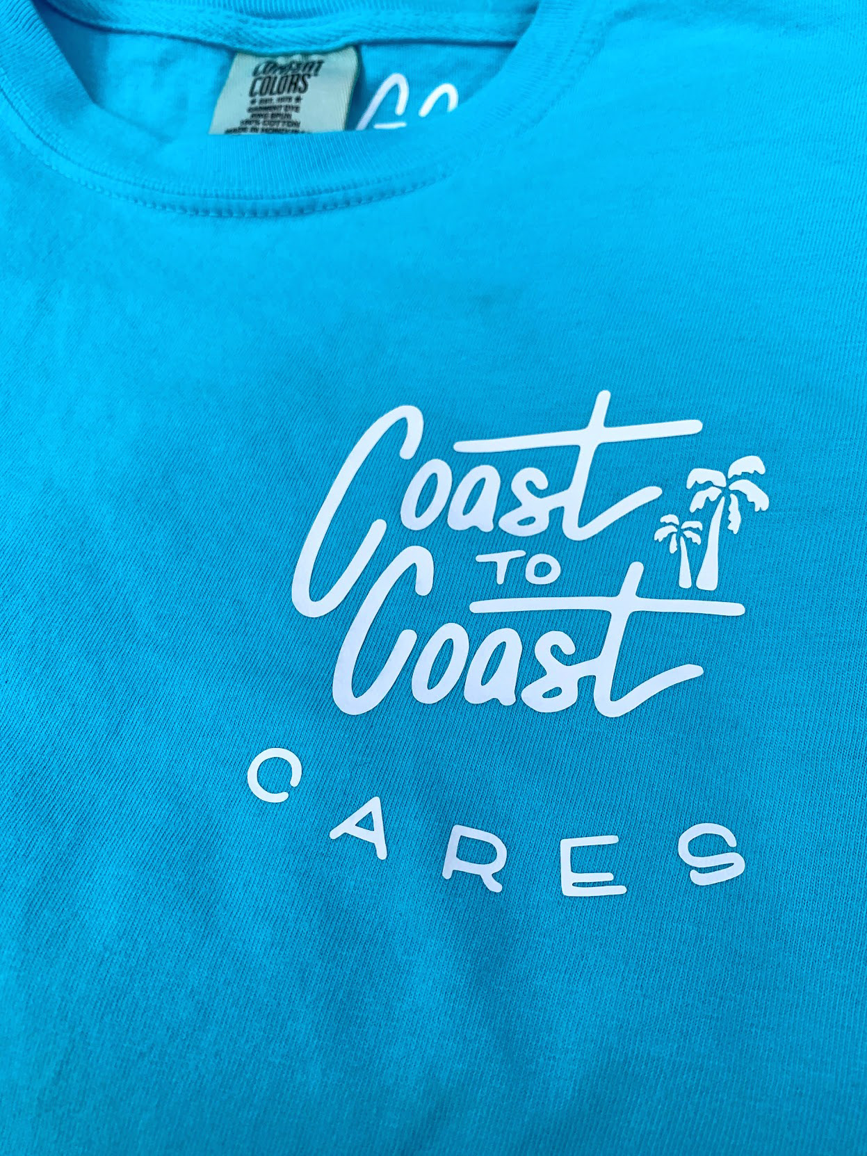
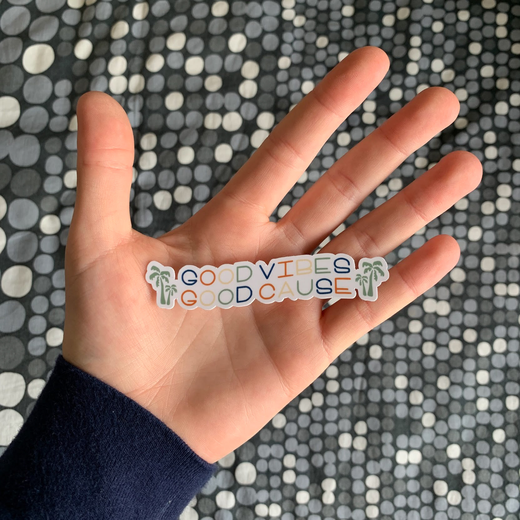
Coast to Coast was developed with a determination to create high-quality, beautiful products for consumers with a desire to give back to the environment we live in. Through the Coast to Coast CARES initiative, we would be giving back 15% of each sale to the designated partner non-profit organization. These organizations would include the Surfrider Foundation, the World Wildlife Fund, and the National Parks Foundation.
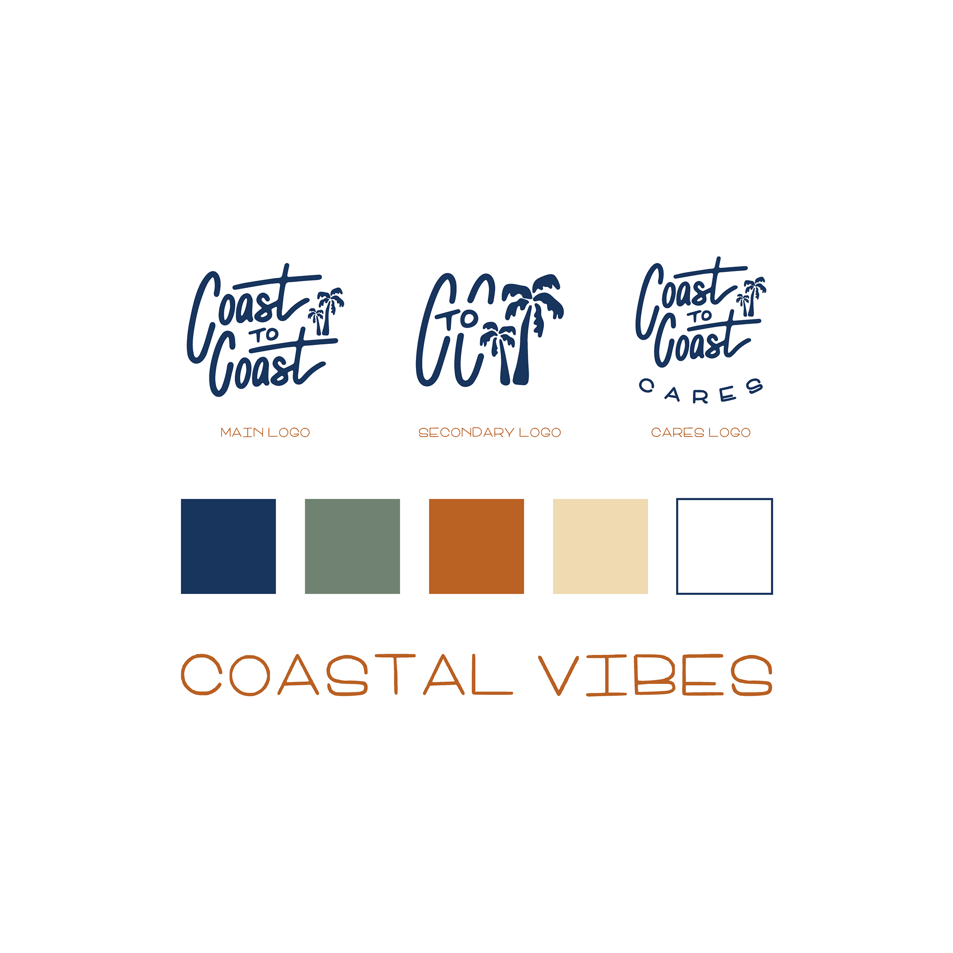
Branding
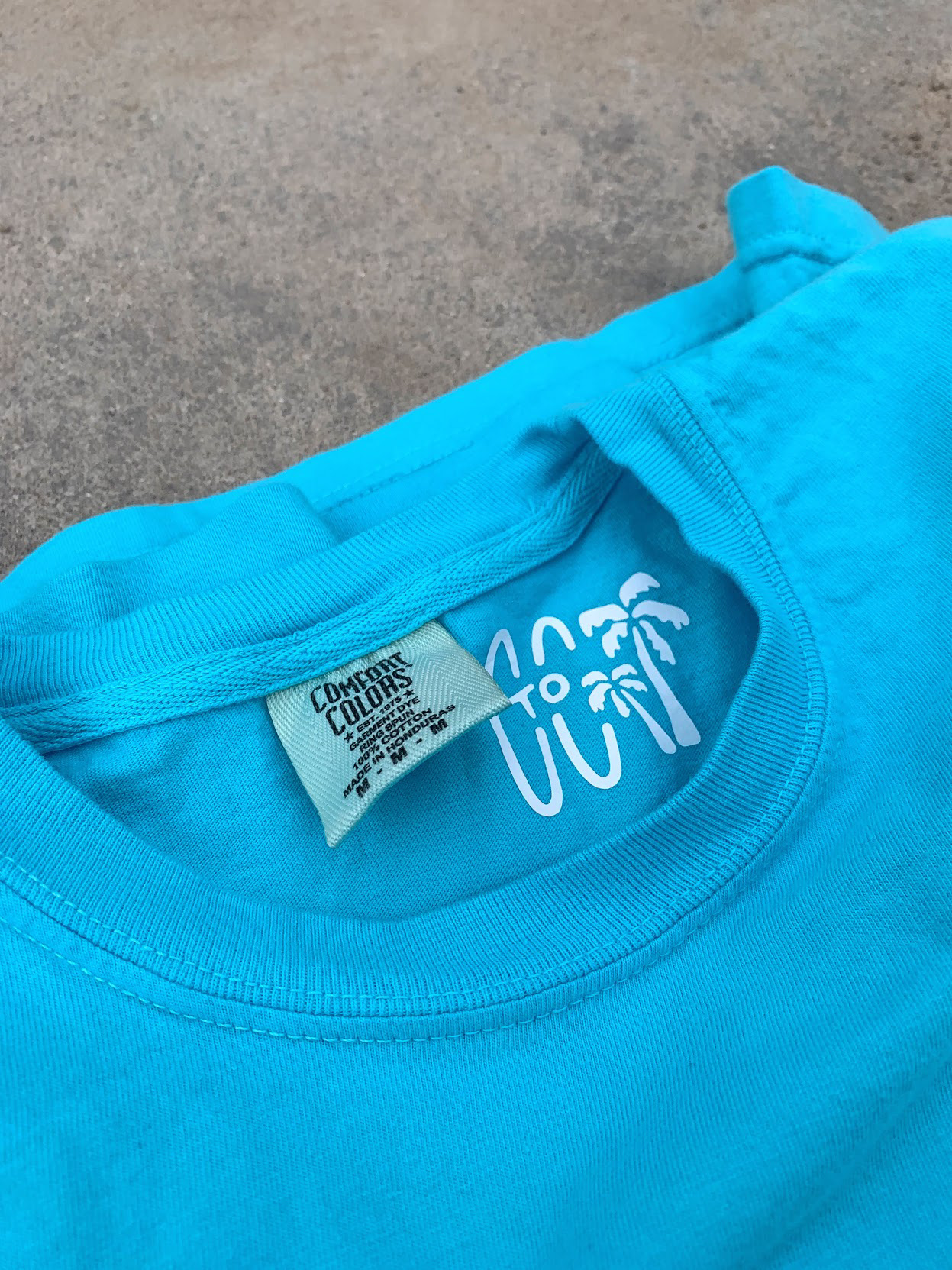
The logos highlight a hand-drawn aesthetic, showcasing palm trees that can be found on the coasts.
The colors represent Earth tones and different environments that can be found throughout the United States.
Blue: Oceans, lakes, rivers (Pantone 534 C)
Green: Grasslands and forests (Pantone 5625 C)
Orange: Red rocks found mainly in the west (Pantone 471 C)
Tan: Beaches and deserts (Pantone 7506 C)
White: Snowy mountains
Coast to Coast takes advantage of having a custom-made font throughout the brand. 'Coastal Vibes' was designed specifically for Coast to Coast, giving the brand a unique typeface to be used for headlines and merchandise.
Posters
Each poster designed for the Coast to Coast cares project was illustrated in Procreate before being printed and mounted on poster board. The posters were the heart of the project, as most of the other merchandise incorporated one of these six designs.
Shirts
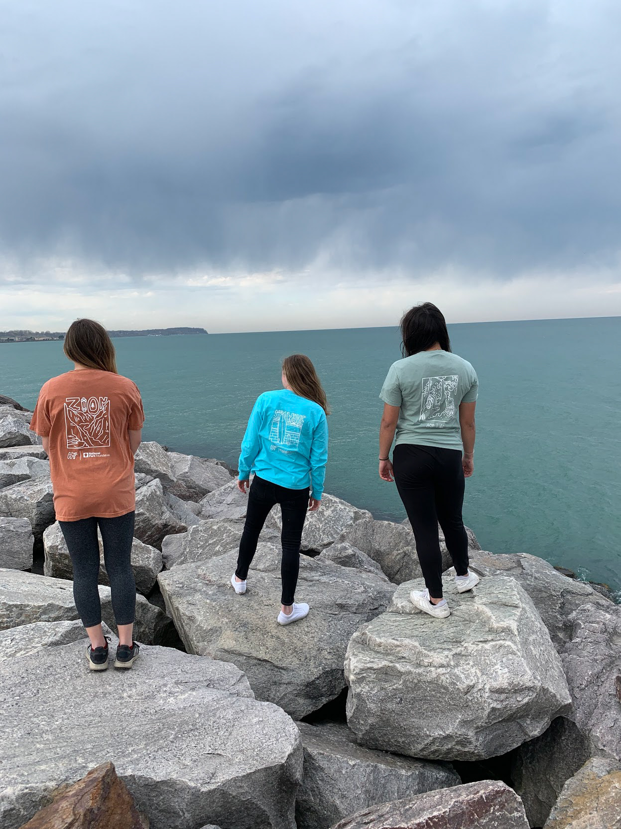
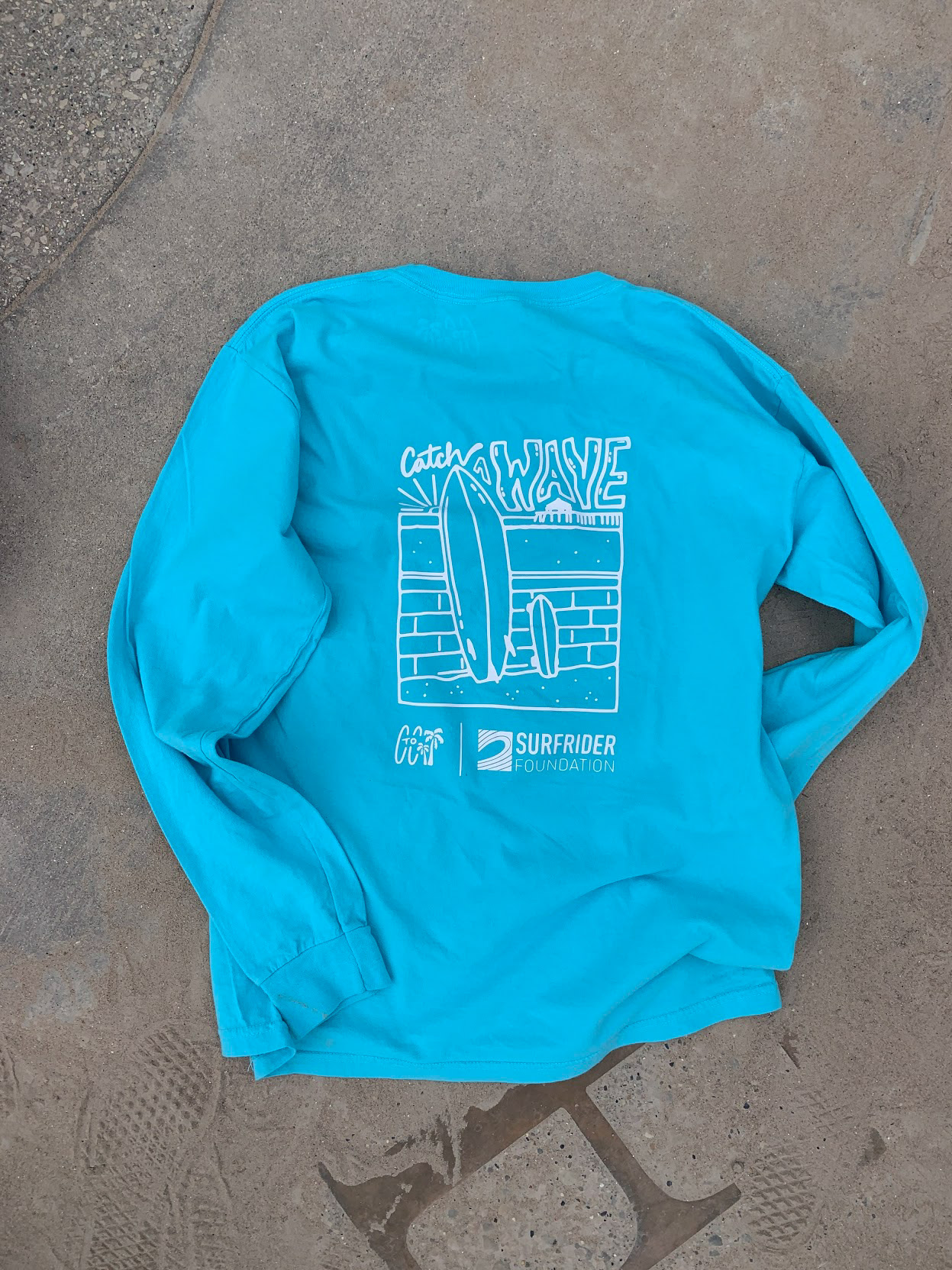
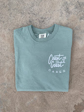
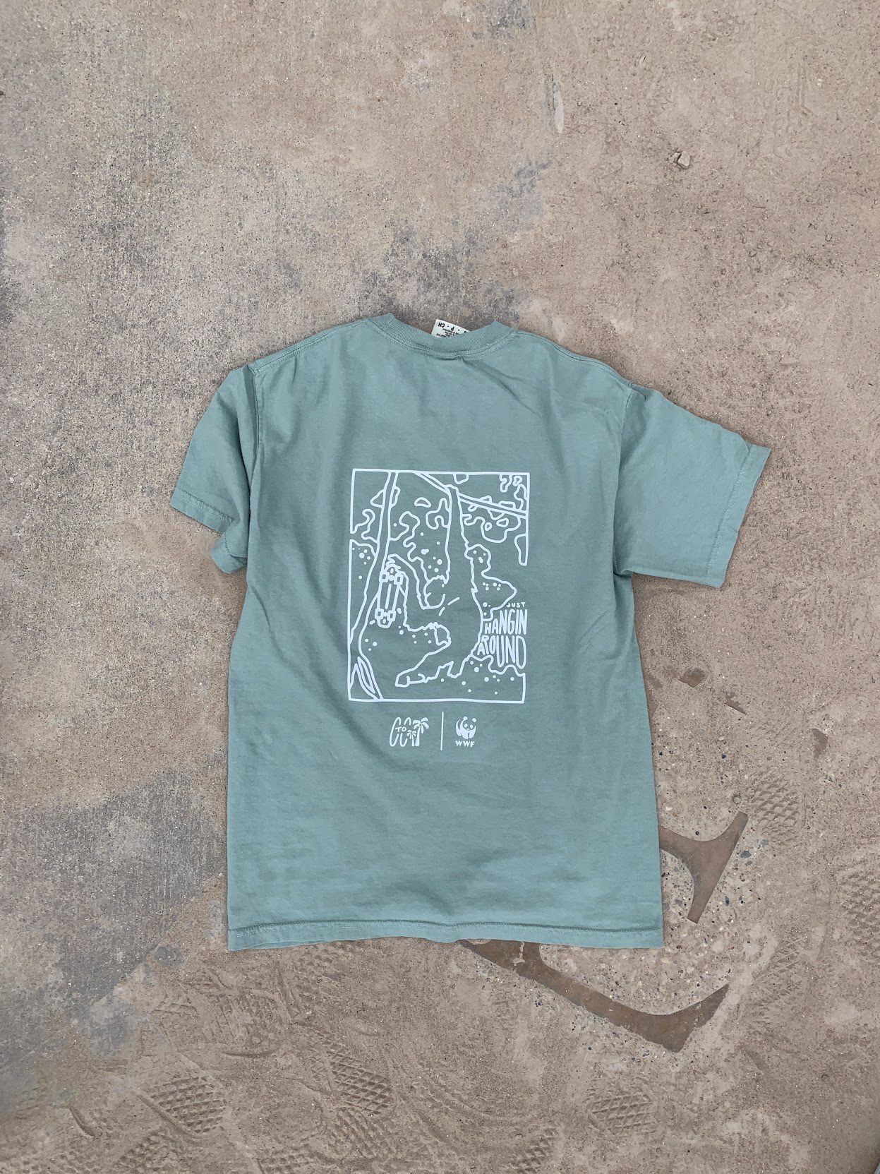
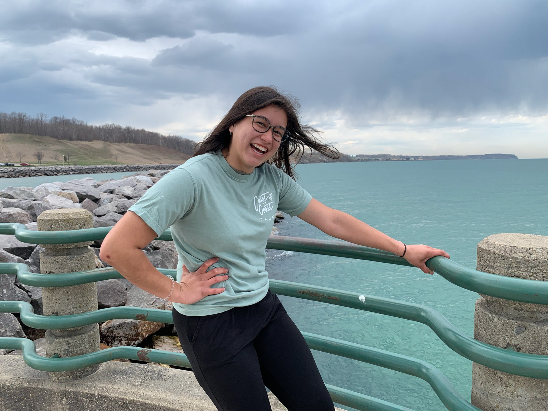
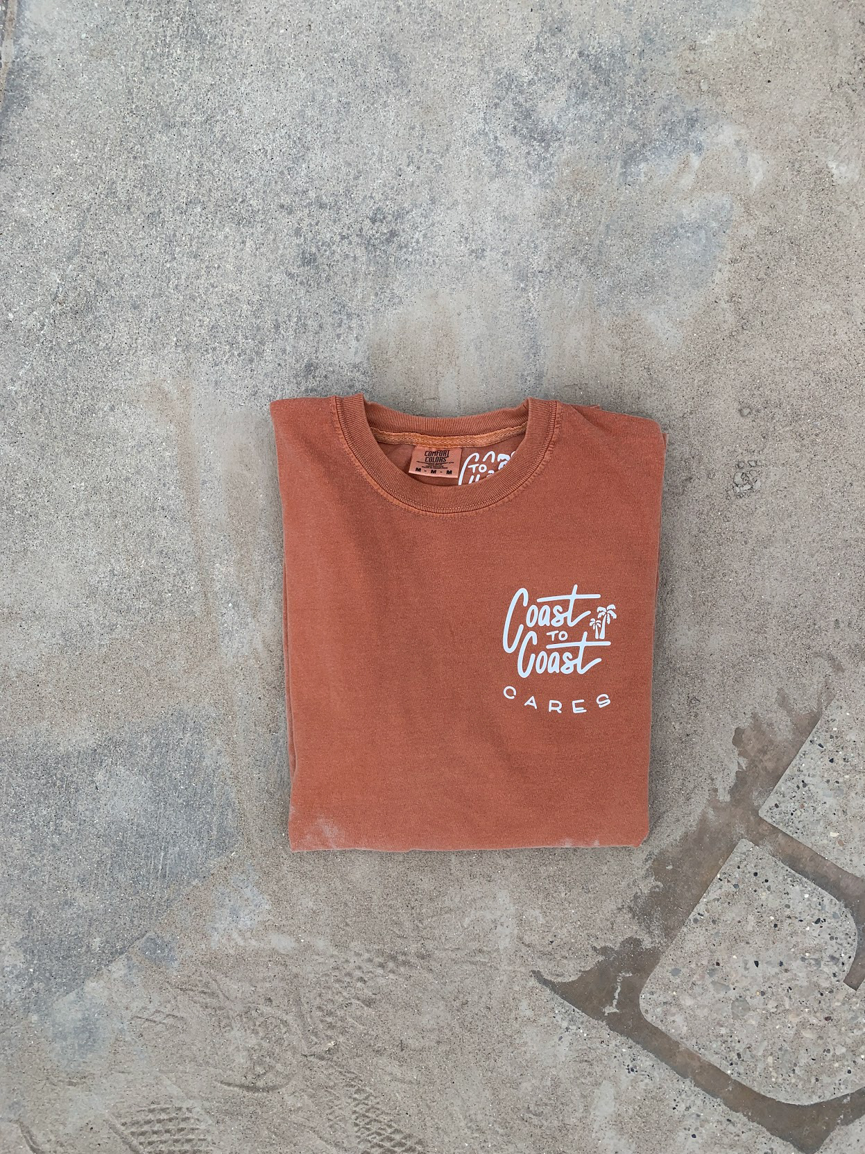
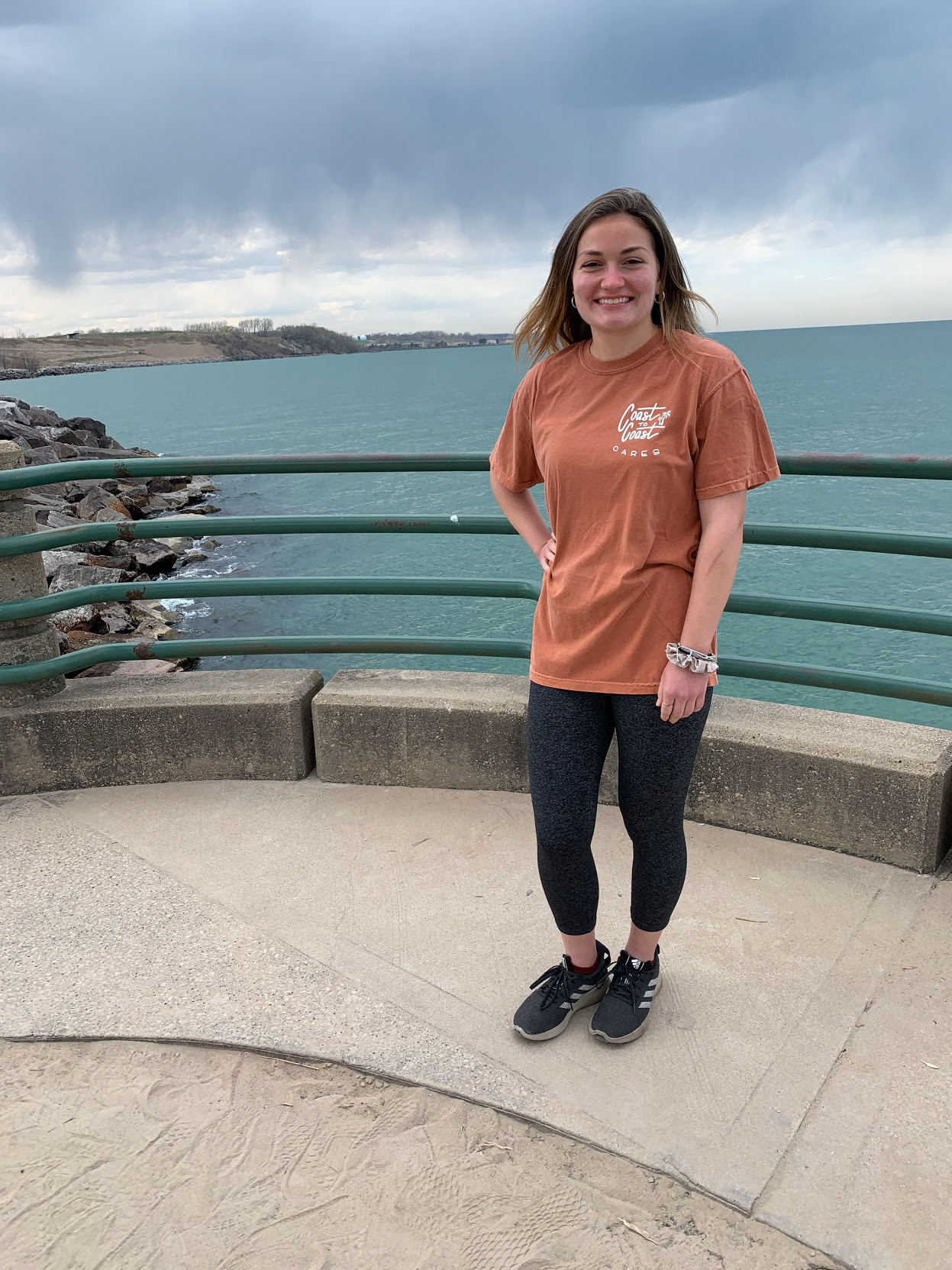
For the Cares shirts, each design was illustrated in Procreate, transferred to Illustrator to incorporate the other logos, then cut from heat transfer vinyl with a Cricut machine and heat pressed onto the shirts.*
*These shirts would have ideally been screen printed, but as a small batch of mockups, HTV was sufficient as these were not meant to last a lifetime.
*These shirts would have ideally been screen printed, but as a small batch of mockups, HTV was sufficient as these were not meant to last a lifetime.
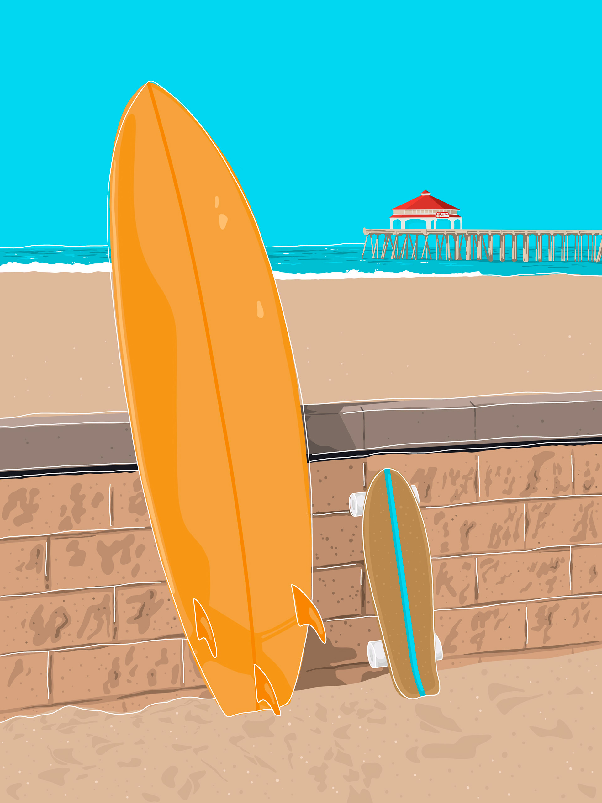
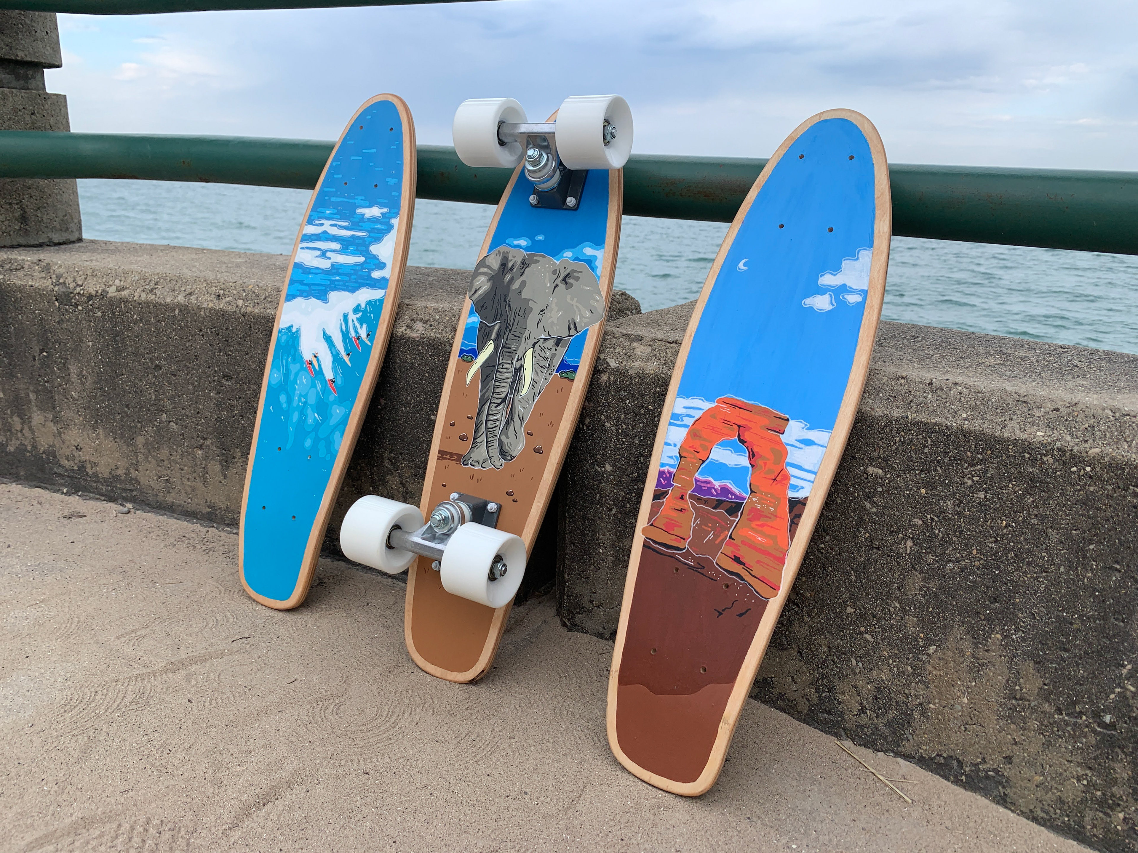
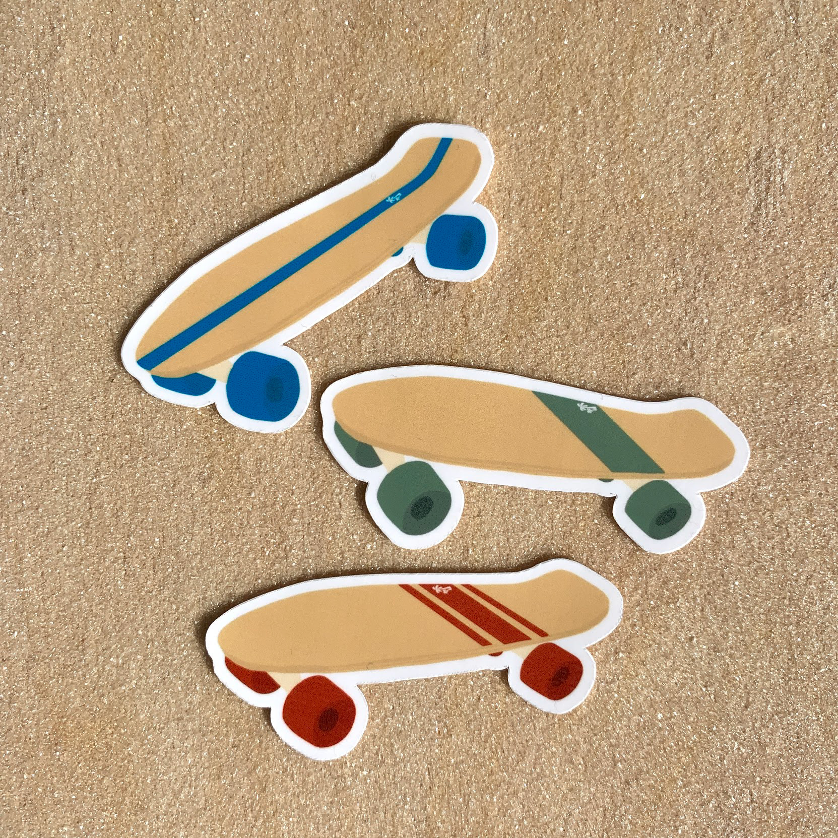
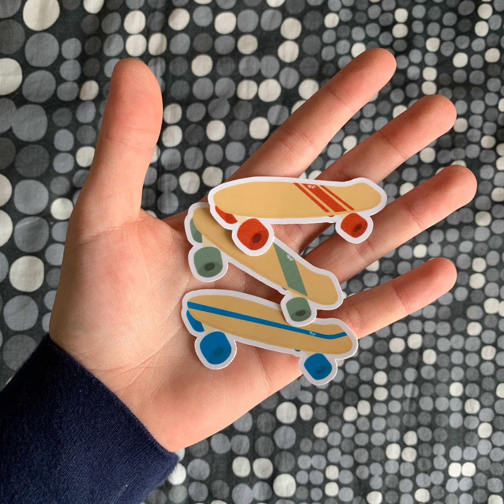
Skateboards
Crafted from sheets of birch plywood, these mini cruiser boards were the most unique of all the Coast to Coast projects. To make these, I started by cutting the quarter-inch plywood down to size, gluing two sheets together, and pressing them with clamps to create concave down the center of the board and a kicktail. After this, I traced a pattern, cut the skateboards out with a jigsaw, and rounded the edges before sanding the entire board and drilling the holes for the wheels. Finally, the designs were painted on and the additional hardware was installed on one of the boards.
Stickers
Website
The Coast to Coast theoretical website was created with simplicity in mind. The main purpose of any website is to highlight the content it is holding and to look good while doing it. In this case, being a store, the products are the main focus and the rest of the site is cohesive with the branding designed at the beginning of this project. The additional information is relevant, providing insight into what this brand would be all about and introducing a balance between products and story.