
The 'Deck of Color' project focused on color, typography, and taking inspiration from a well-distinguished artist. To achieve all of these traits, our cards required lots of research and brainstorming. In the end, we were left with heavily stylized, fun final pieces.

Inspiration
Jasper Johns: For my deck of cards, I was inspired by the style of Jasper Johns, an artist who did a lot of work painting maps and flags in a sort of abstract manner. His work inspired the art community, which was looking for a new style at the time that went away from expressionism and was also not completely abstract. Johns also was able to use a lot of bright color in his work to make things pop out, but still somehow remain somewhat hidden.
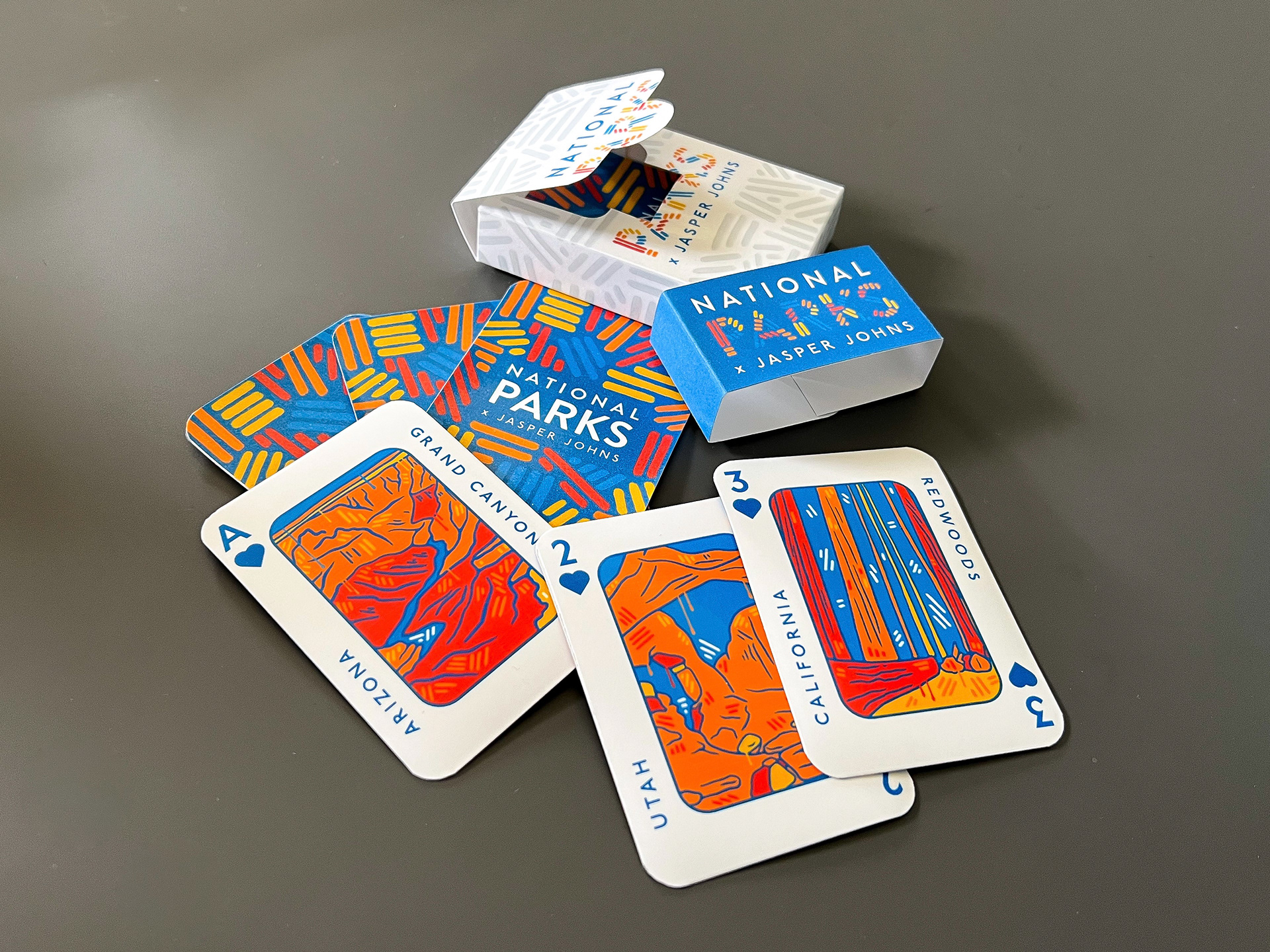
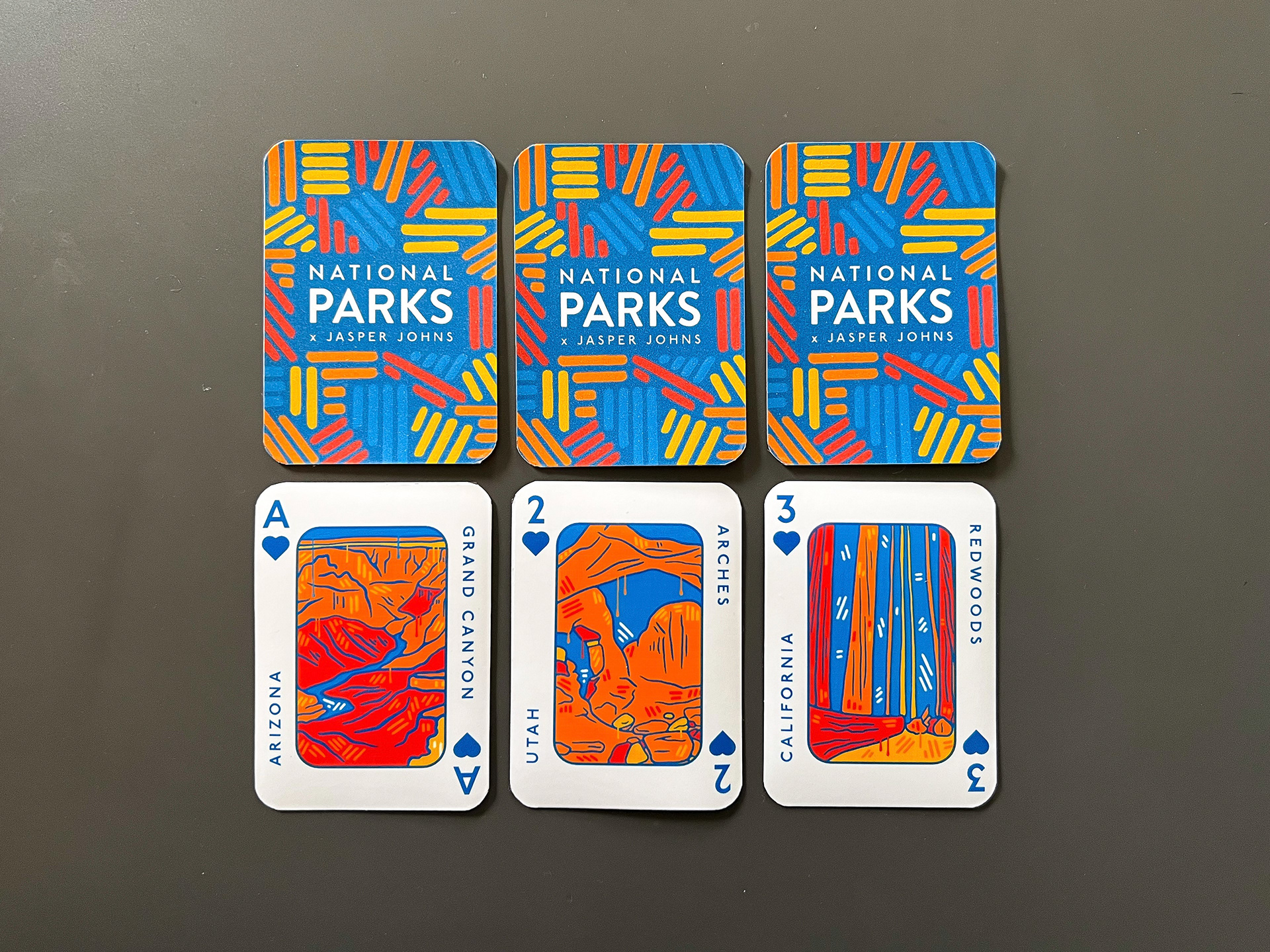
Cards: After seeing some National Parks cards on Pinterest, I decided this was the route I wanted to follow. I was also able to tie this back to Johns, as some of his most notable work was an American flag and a map of the United States. What better way to show off America than our top National Parks? Although I did not take too much inspiration from his style in the previously mentioned paintings, I did include the brushstroke look and a different style he used by creating patterns of lines.
Central Designs
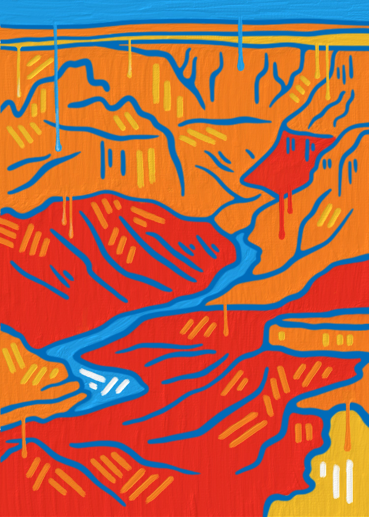
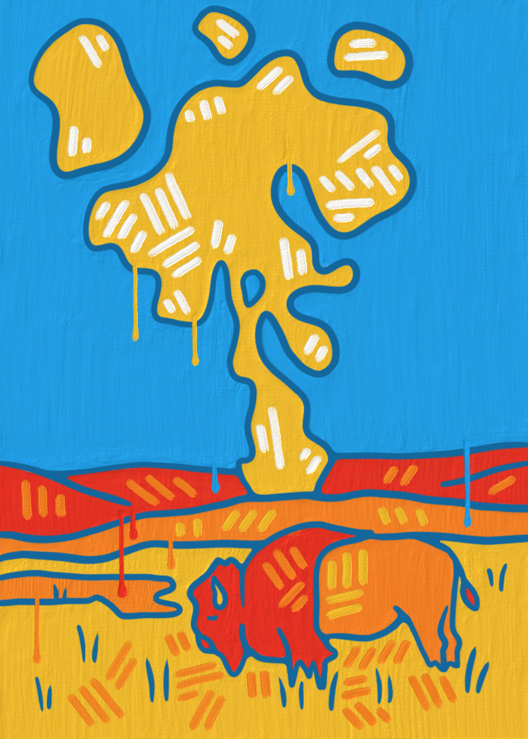
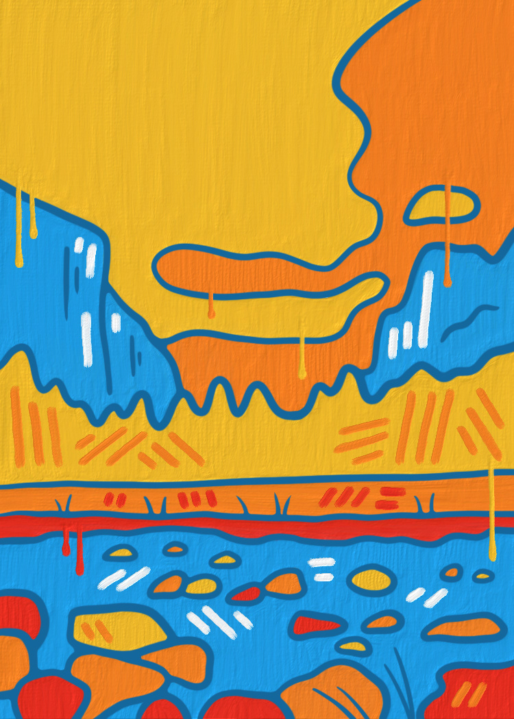
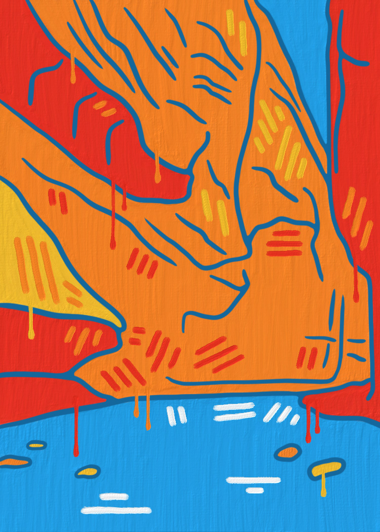
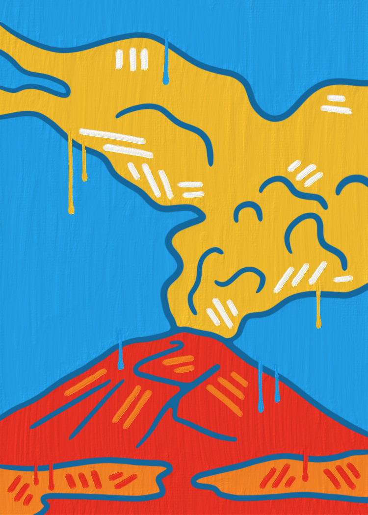
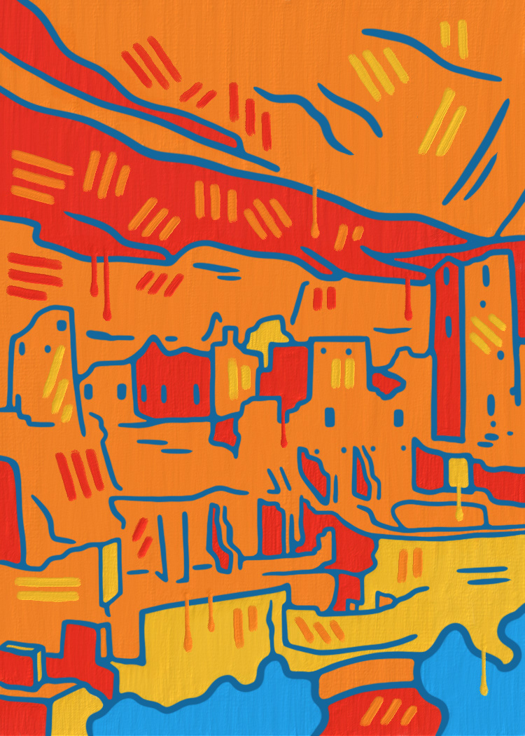
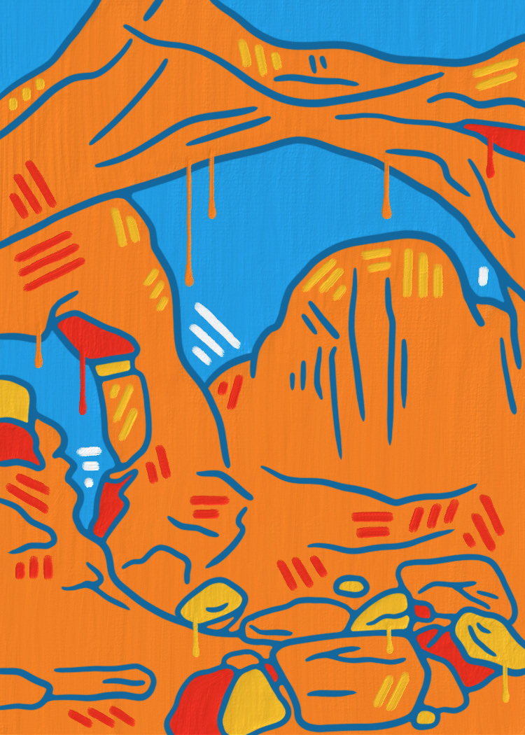
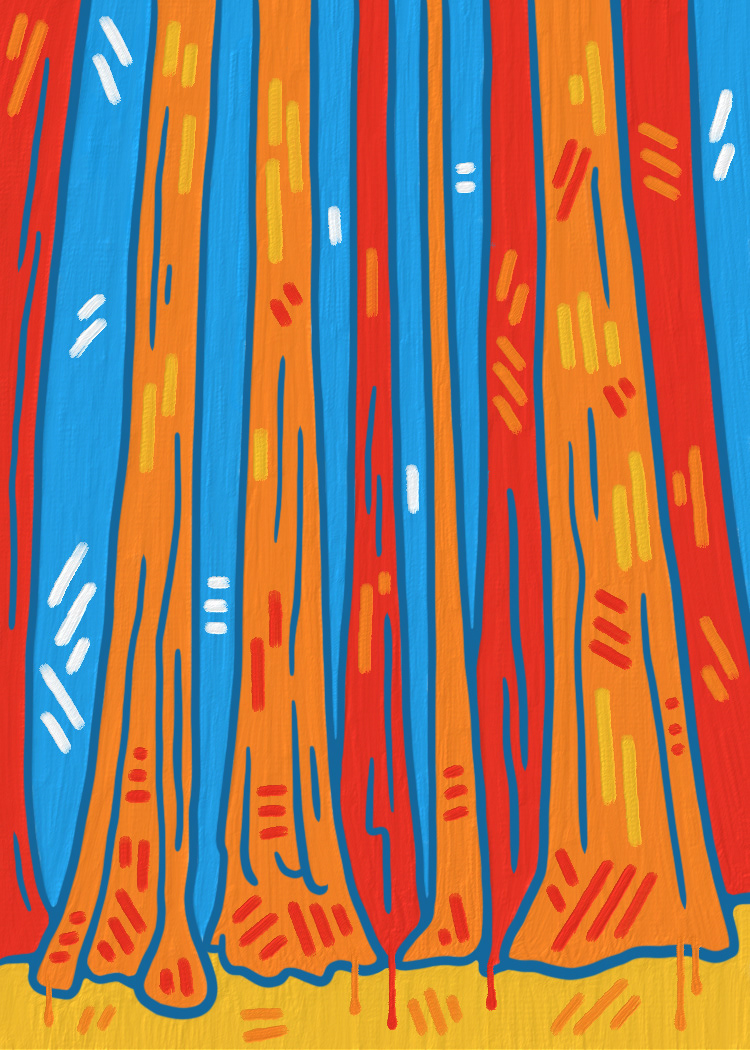
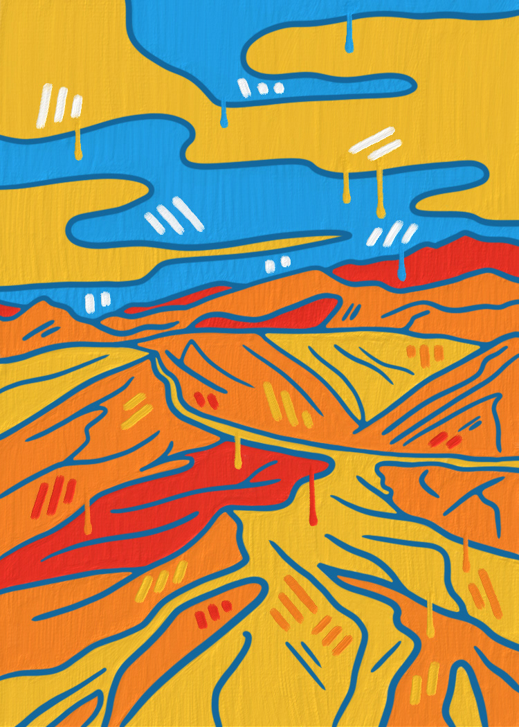
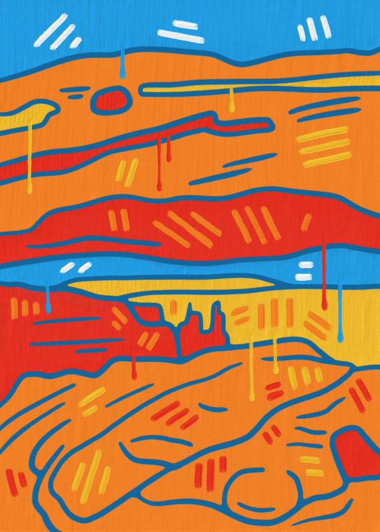
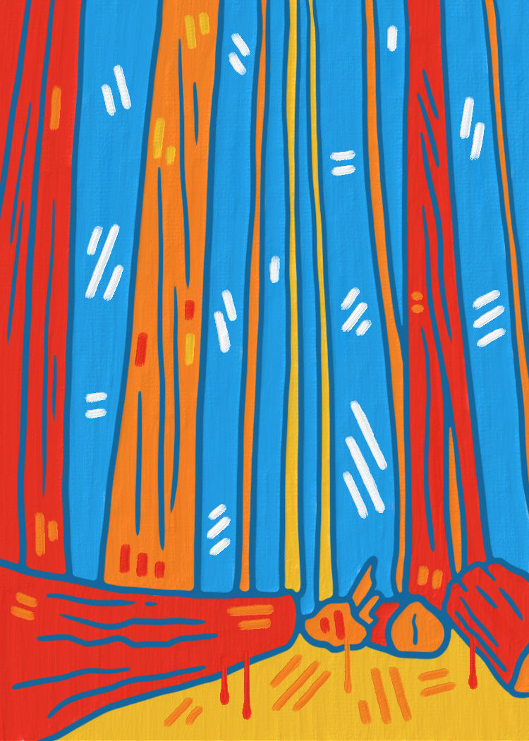
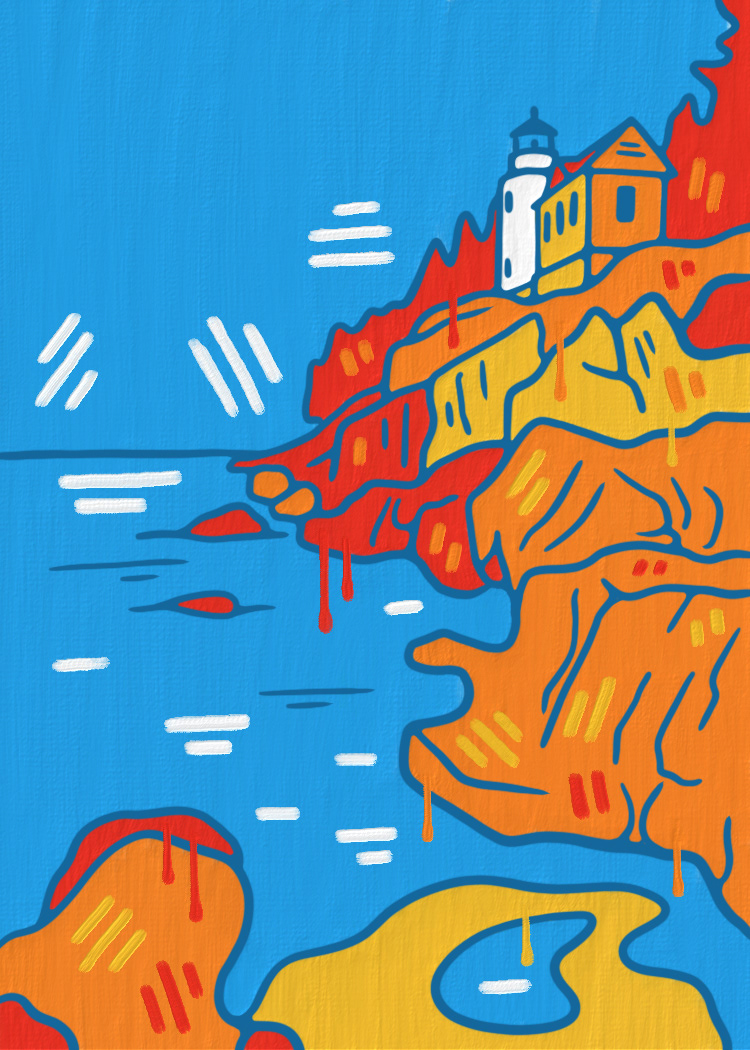
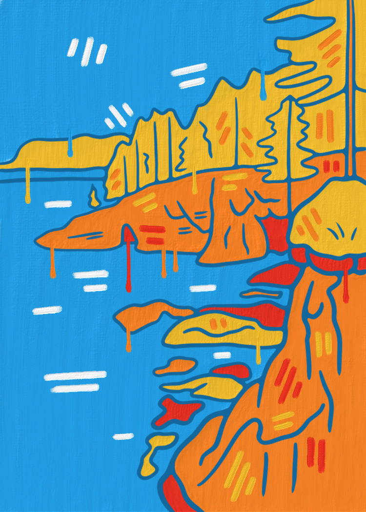
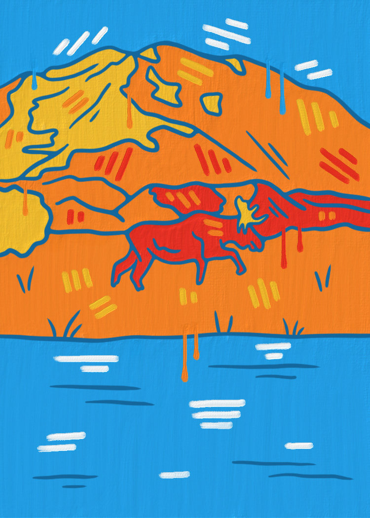
After researching Jasper Johns, I started drawing out my National Park scenes. Utilizing Adobe Fresco's live paintbrushes, I was able to achieve texture within the images. Pairing split complementary colors with the brush stroke appearance, these 12 designs merge one of John's styles with my own free-flowing outlines.

Card Layouts
After creating the centerpiece designs, I inserted them into the cards and framed them with the card number, National Park name, and state where you can find each park. The front of the card ties everything together, including all the colors from the designs put into a paint stroke/line art pattern.
Card Production and Summary
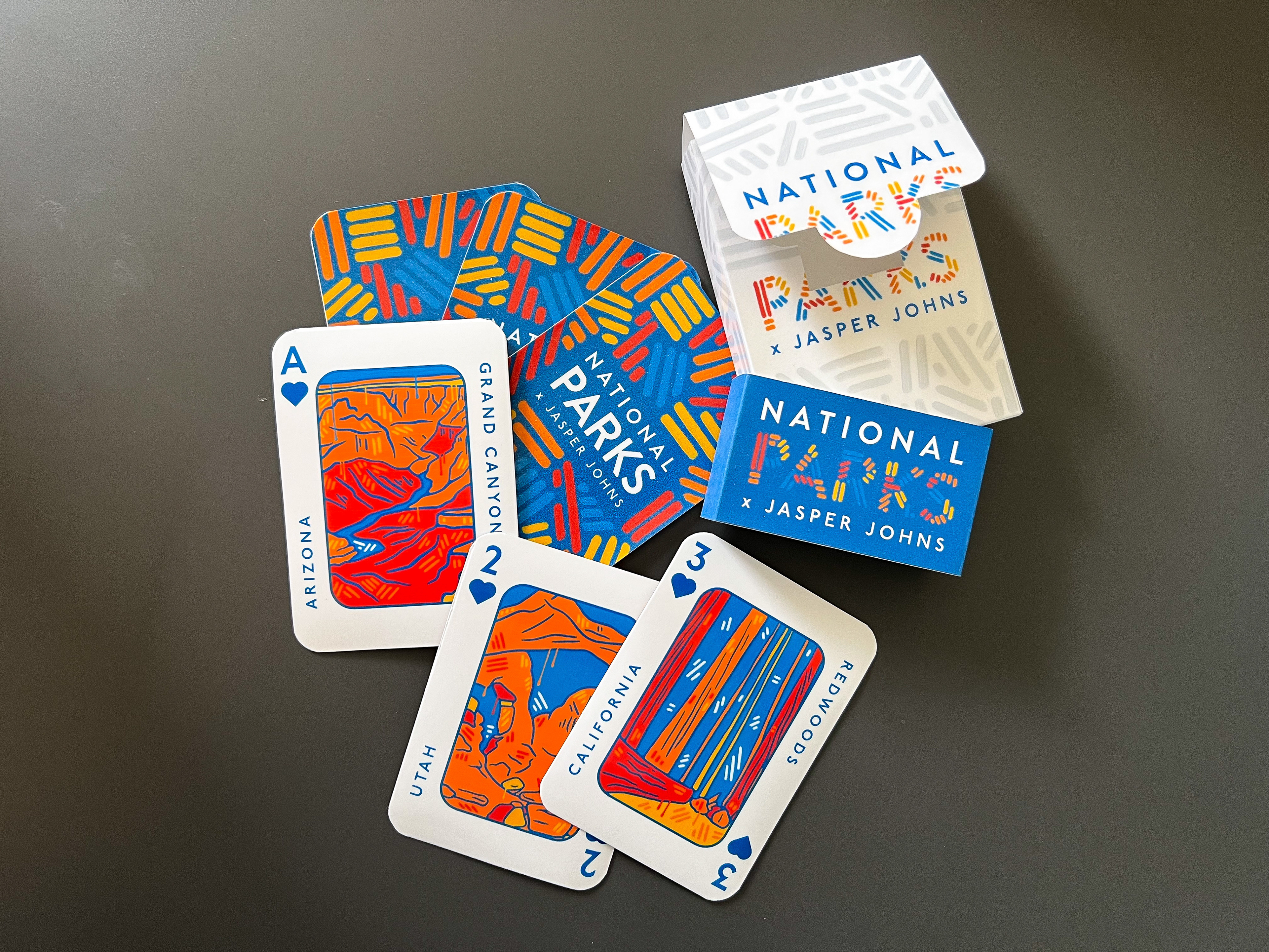
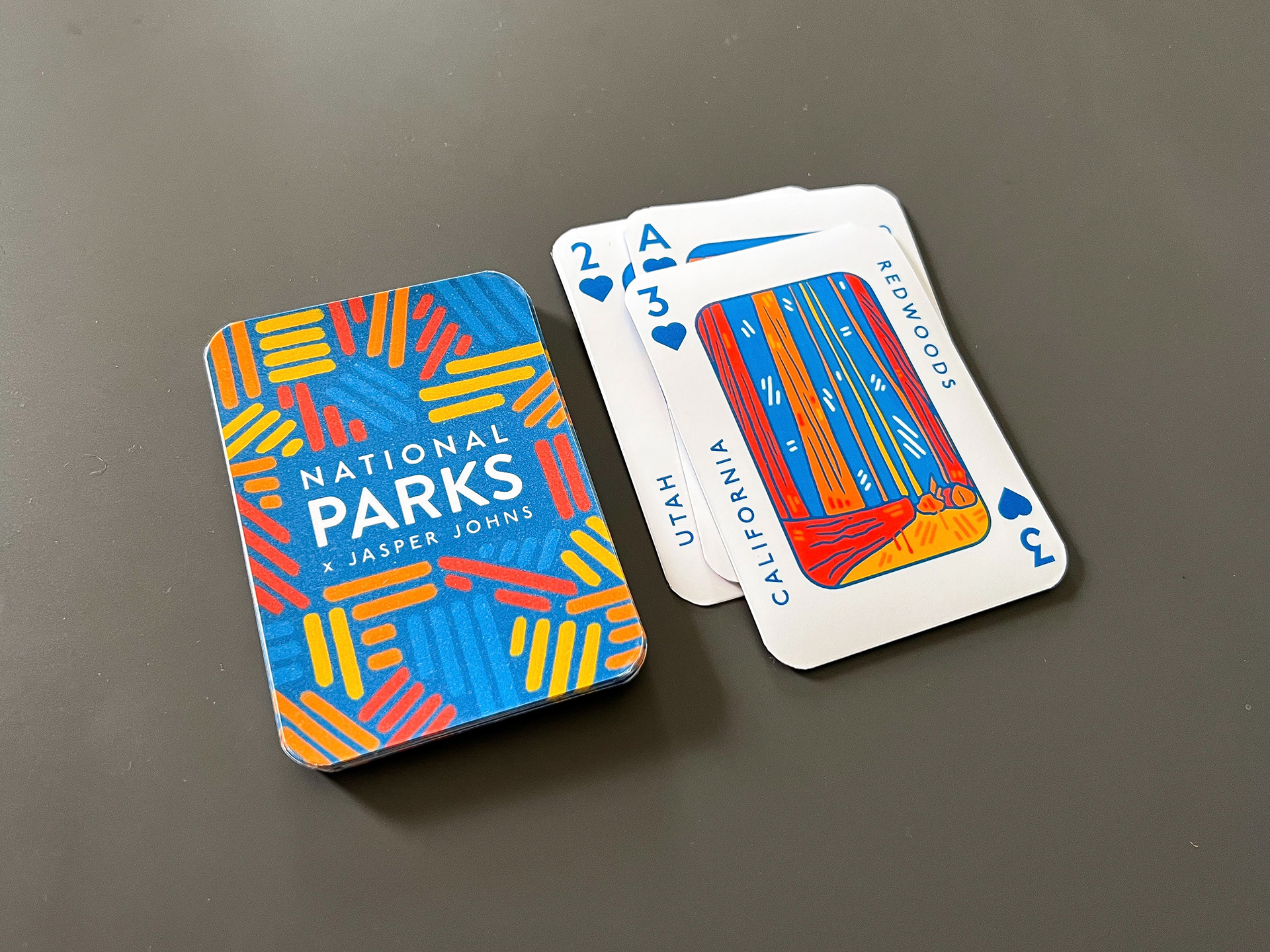
Once the cards were finalized, I was able to design a box for the cards and a sleeve to cover the opening. I printed out all of the cards (one side on cardstock and one side on sticker paper to be able to put both the front and back together) and laminated them to protect them from any sort of usage. For the box, I printed out the dieline with the design on it, cut it out, and secured the tabs with double-sided tape.
Overall, as with the Coast to Coast project included in this portfolio, I really enjoyed making everything from start to finish and coming out with a tangible, high-quality, final product. The result of this entire project left me with an eye-catching, high-contrast set of cards with a nice Jasper Johns influence. It is not necessarily easy to incorporate other artists into your work, but if you are able to accomplish it in at least the slightest regard, you are left with something unique and rather interesting.