
Footy Melick Soccer Training
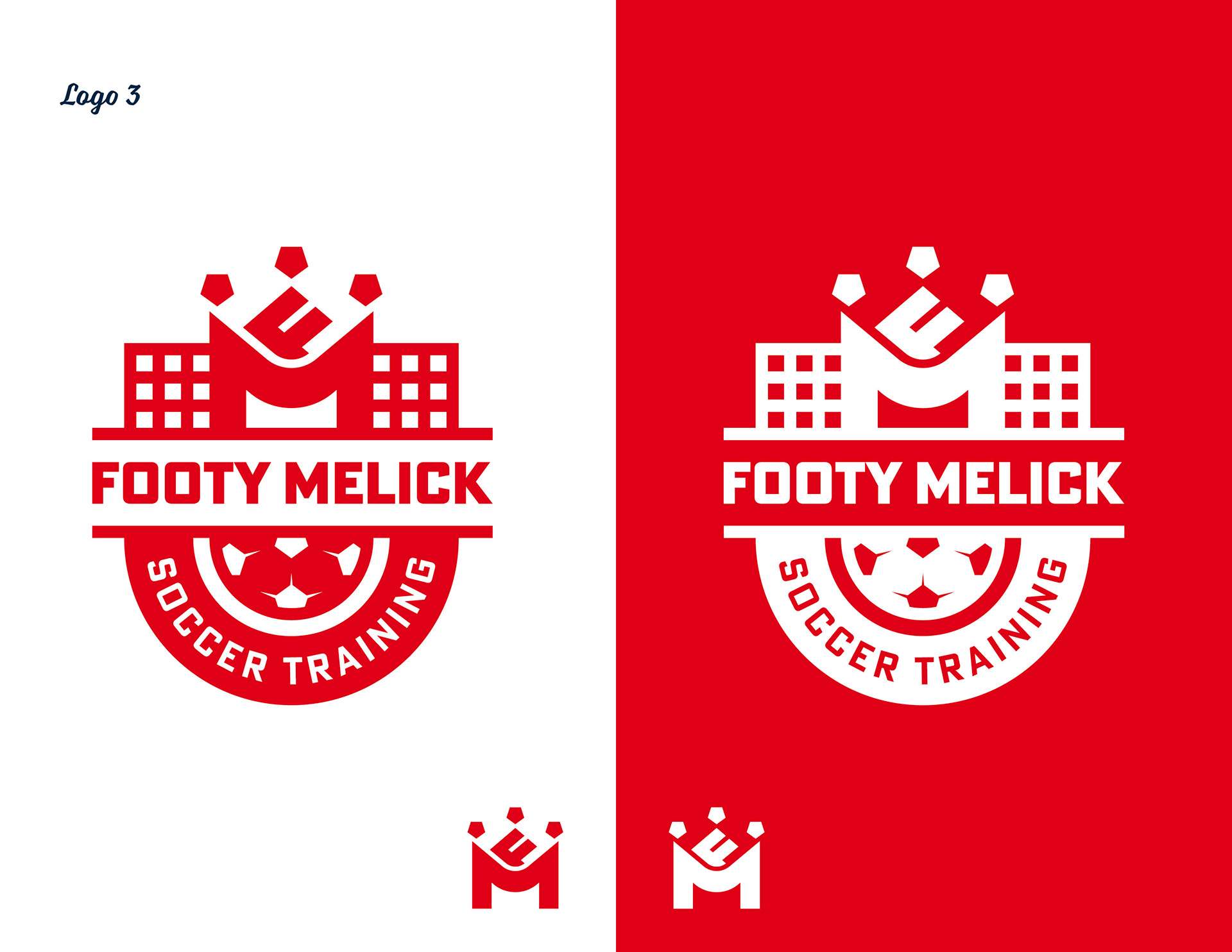
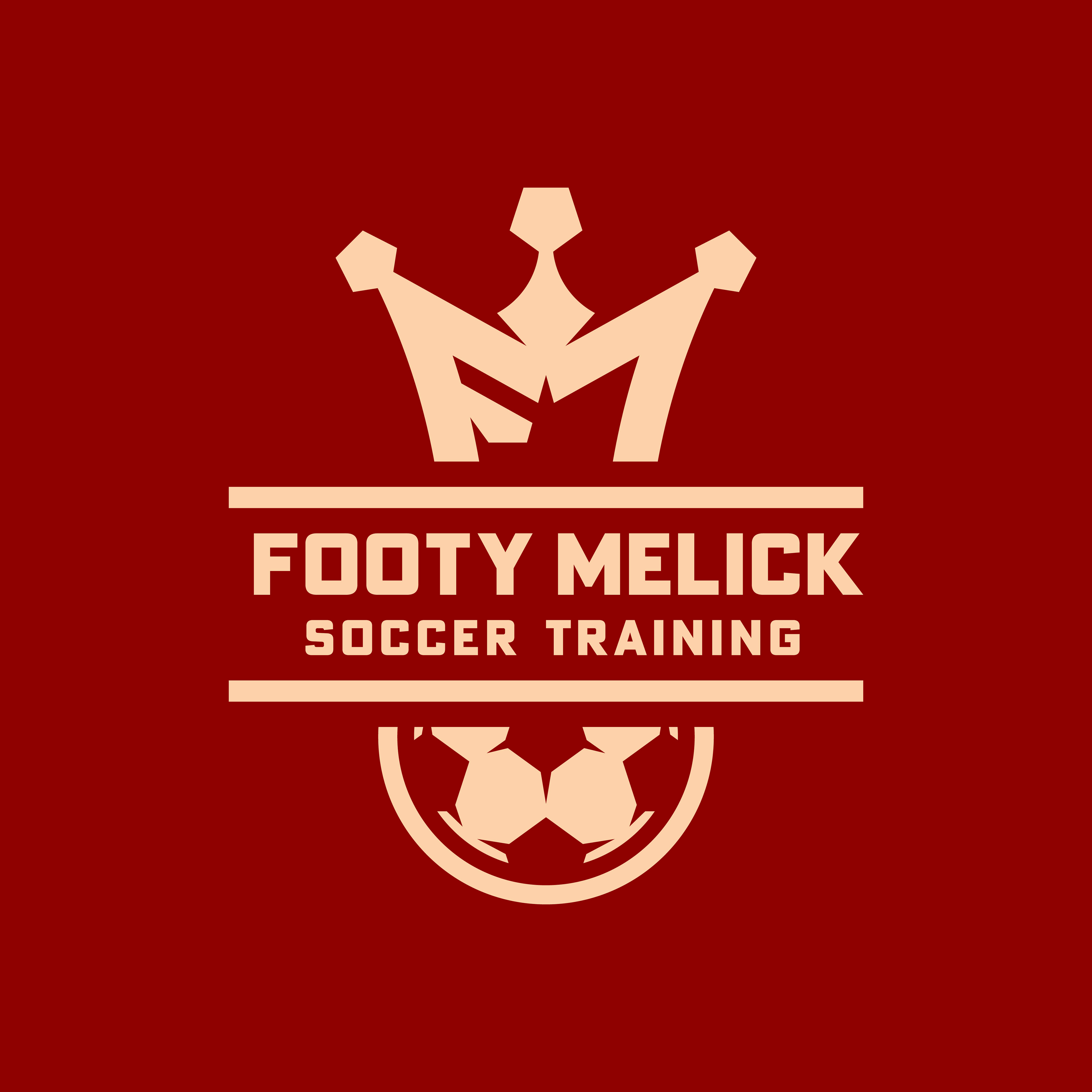
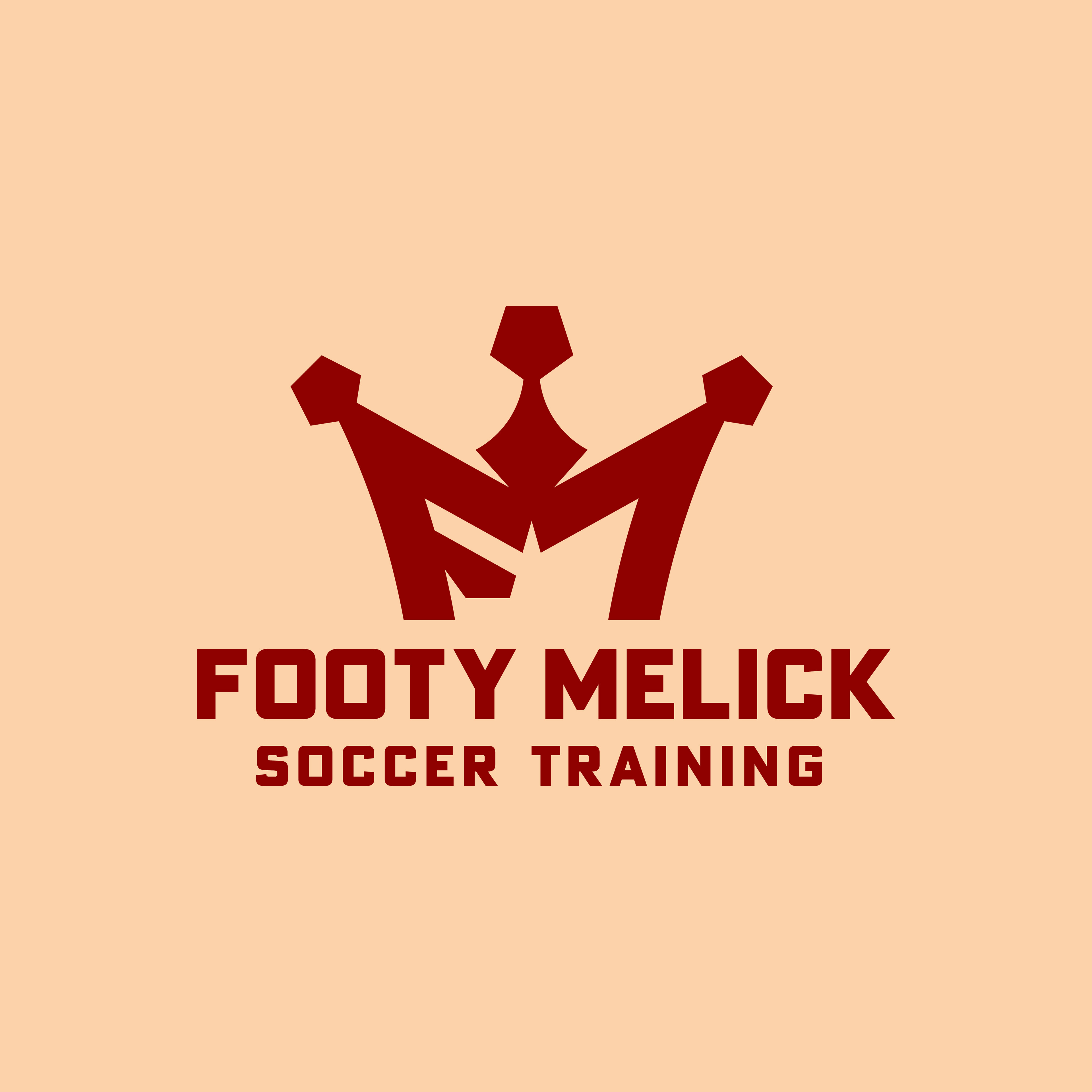
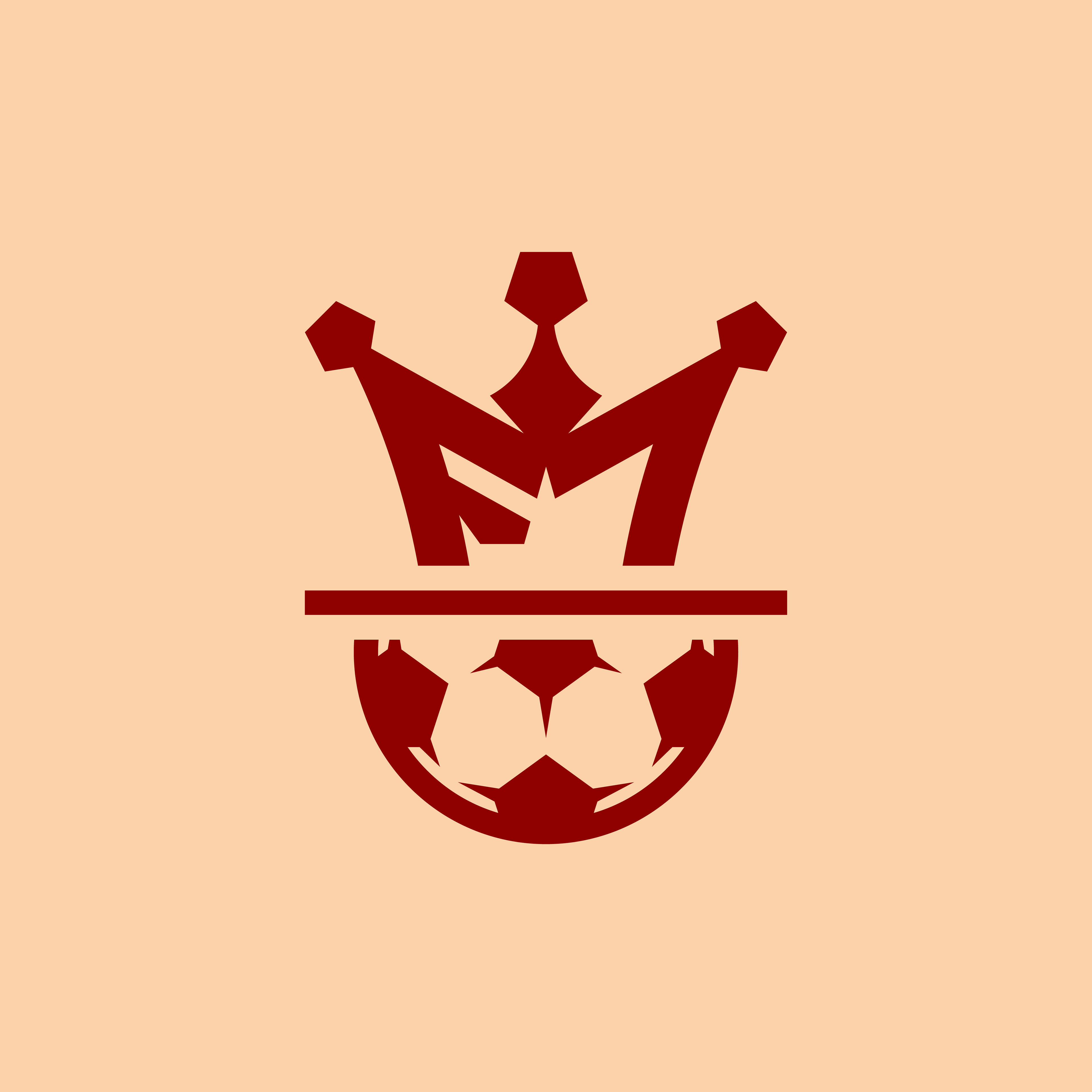
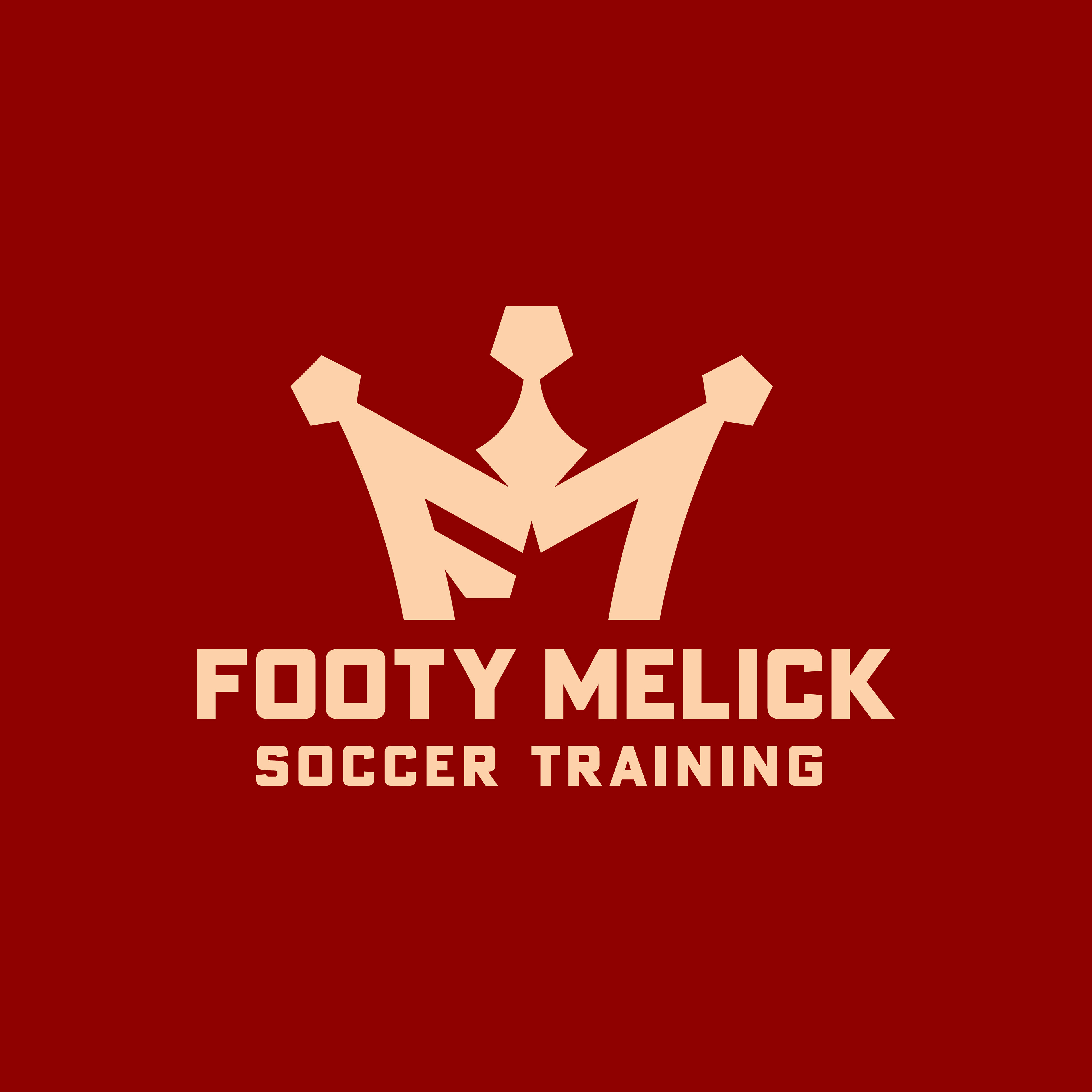
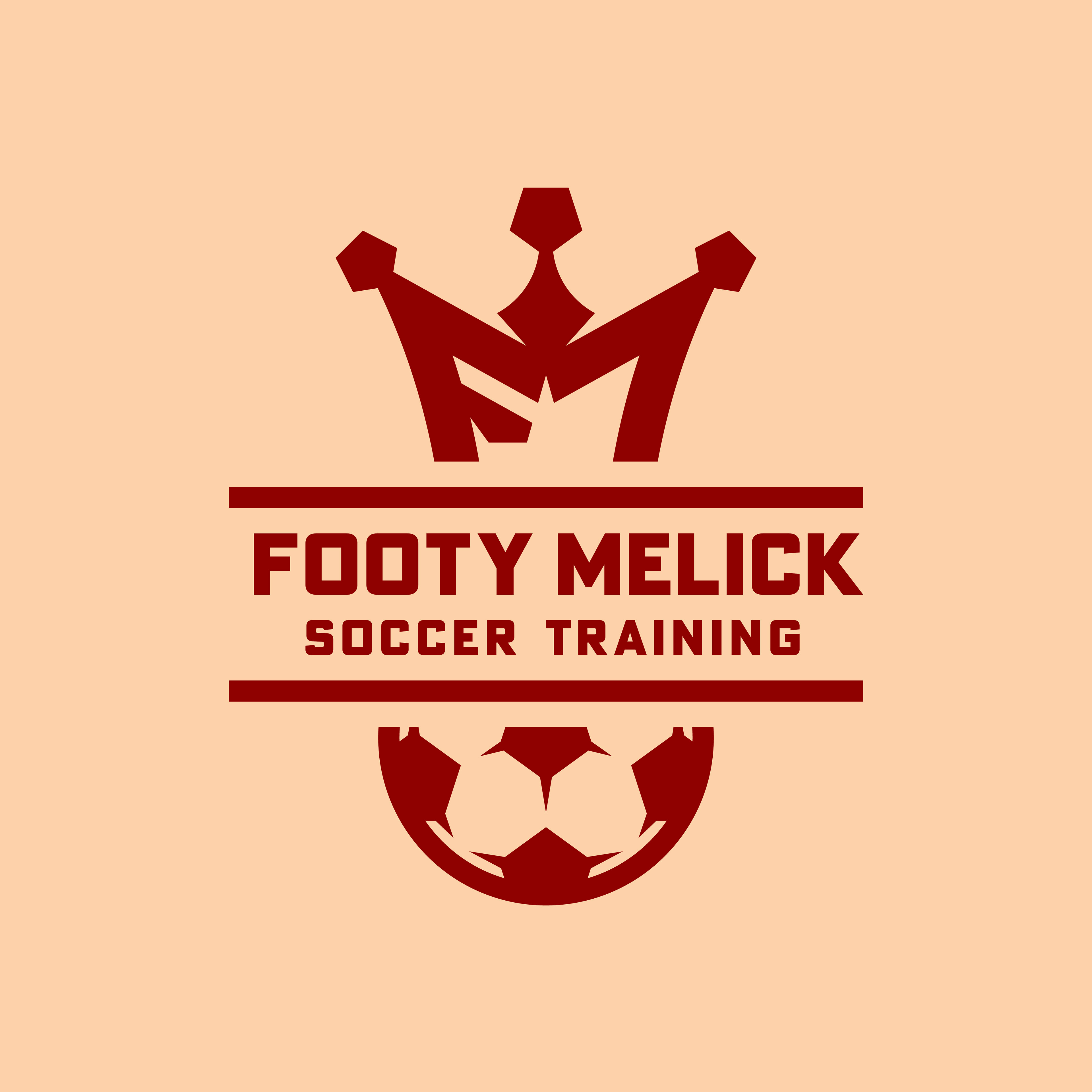
Footy Melick Soccer Training is owned and ran by former UW Wisconsin Men's Soccer player, Noah Melick. Noah wished to craft a logo for his business that incorporated a crown and a soccer ball that would be unique to him and his brand. The base of the crown was built from the 'F' and the 'M' of 'Footy Melick' and the crown's jewels are pentagonal to represent the shape of one of the panels most commonly used to create a soccer ball. We ended up with three variations of the logo to use on upcoming branding assets, such as his website, business cards, and shirts for the players he trains.
-
More to come soon.
Initial Proposed Logos

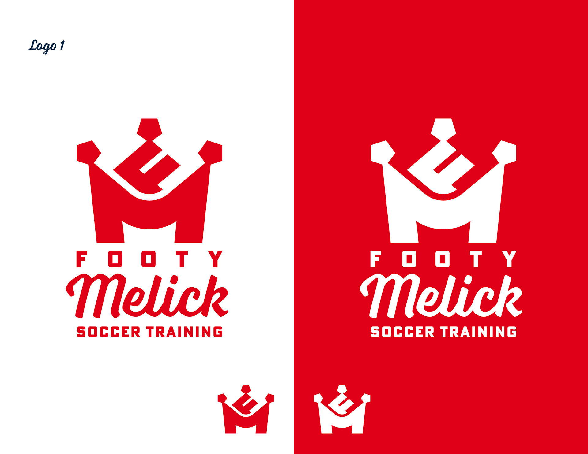
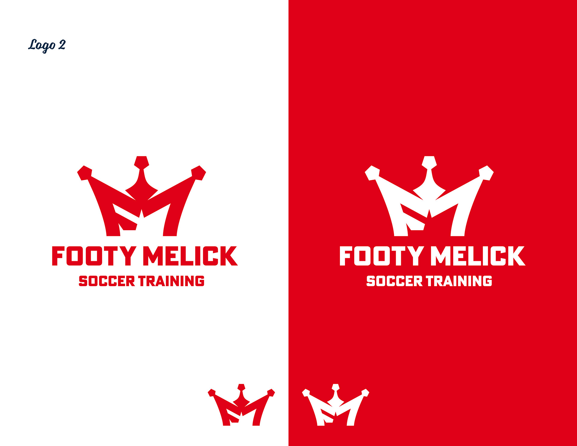
Final Logos
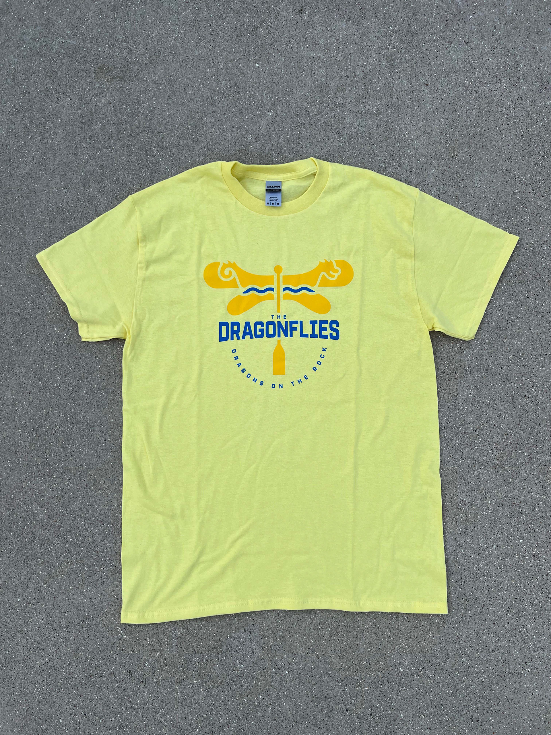
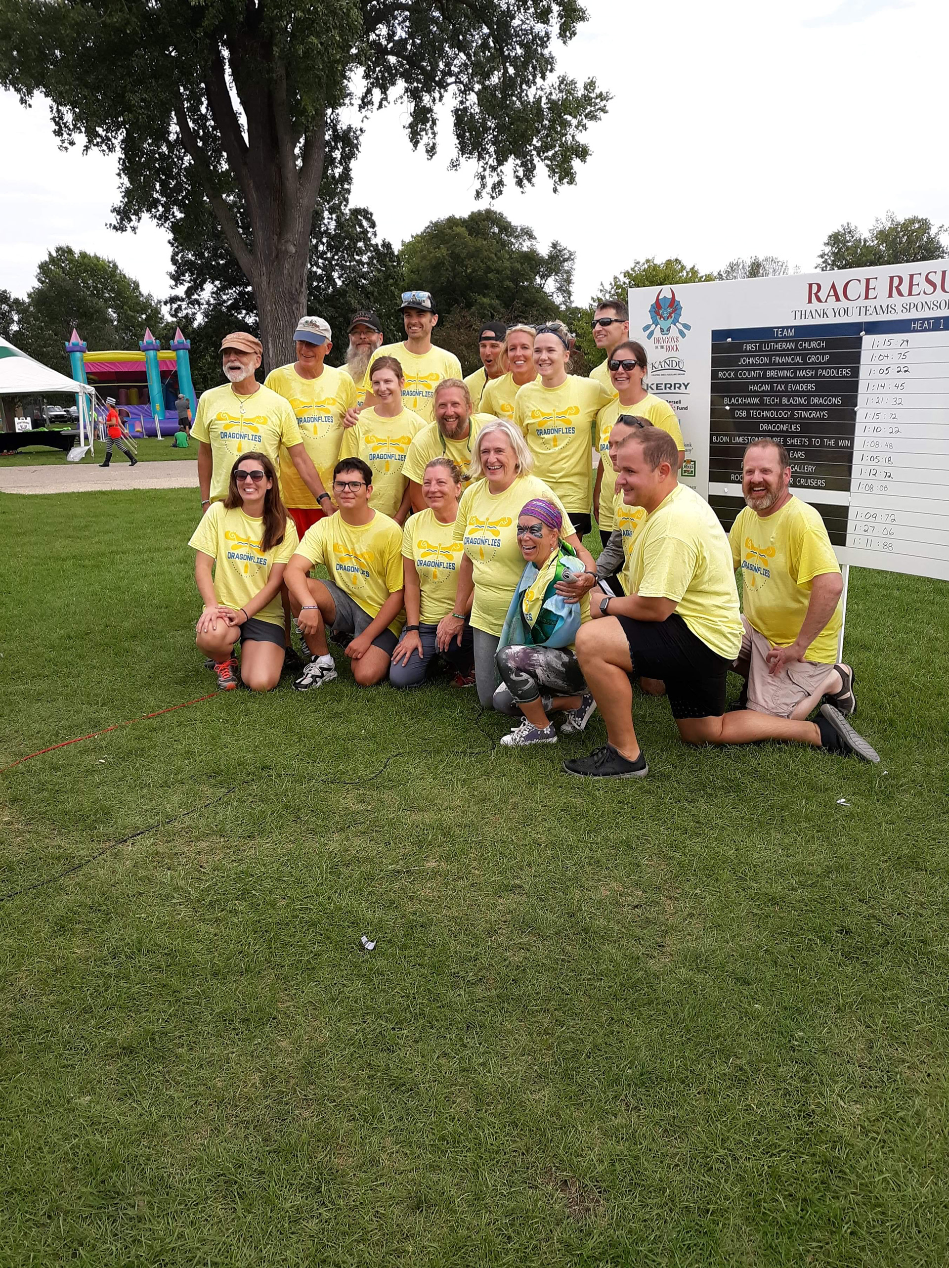
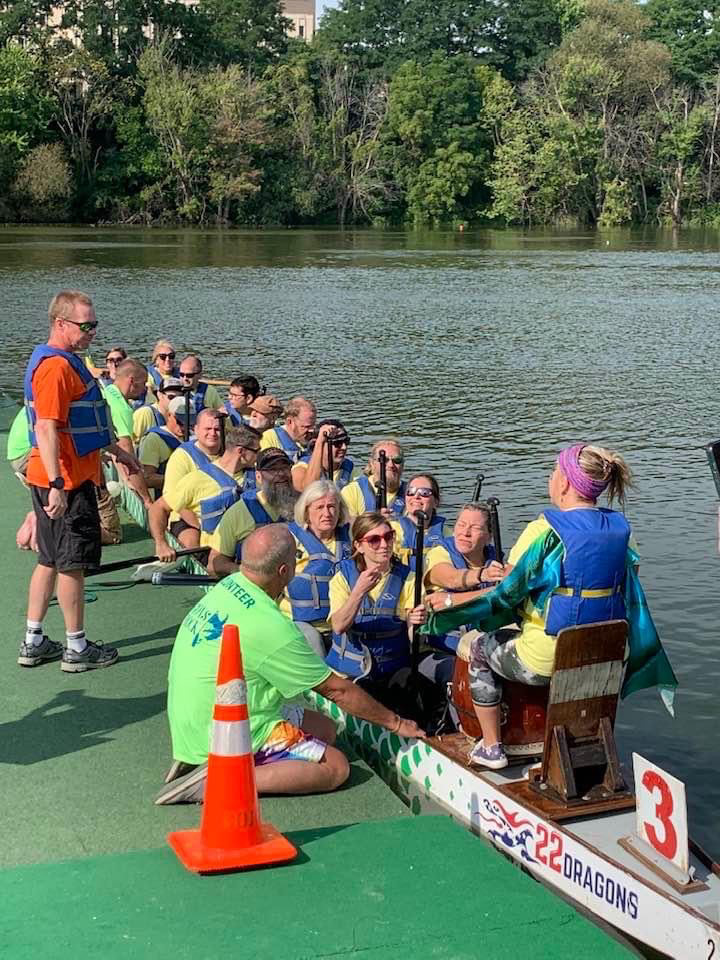
Dragons on the Rock - Team Golden Dragonflies
Dragons on the Rock is a dragon boat race held in Janesville, WI that raises money to benefit Kandu Industries.
Event Description (from Kandu): Rock County’s annual dragon boat race and festival. Cheer for your favorite team of 16-20 high-spirited paddlers and one exuberant drummer, all in one dragon boat! Teams compete in heats throughout the day for the top three spots. Who will bring home the winning trophy this year?
This year, there were 11 competing teams from the area. Kj&Co. was asked to design and produce the team t-shirts for the Golden Dragonflies, as well as participate in the event.

Initial Concept
Once I drew out the dragonfly, I knew a paddle would be able to fill in as the body. The boat also appeared as though it could be worked into the upper part of the dragonfly's wings and with a little tweaking of the shape, I was able to get it there, as well as include the river on which we would be racing the boat.
Design Details
In order for the river to stand out and be more apparent as to what it was, I made the design two colors. Dragonflies can be found in almost every color, so it was up to me to decide what the base color would be (we were originally just named "The Dragonflies," but there was another "Dragonflies" team, as well. After the design was finalized, we became "The Golden Dragonflies"). After researching the symbolism behind the different colors of dragonflies, I landed on yellow, as it represented happiness, honor, and optimism. Blue also symbolized the water, as well as loyalty, faith, and trust. This team was formed of many different community members, so optimism and trust were driving factors of performing well in the race.
The use of these two colors provided contrast and when paired with a bold typeface (Industry Bold, Adobe Fonts), the design came out being sharp and noticeable at the event.


Shirt Production
As a business investment, Kj&Co. acquired a heat press this summer to be able to print merchandise in house after creating designs. Screen print transfers were ordered from an outside source and applied to blank shirts, creating a high-quality final product.
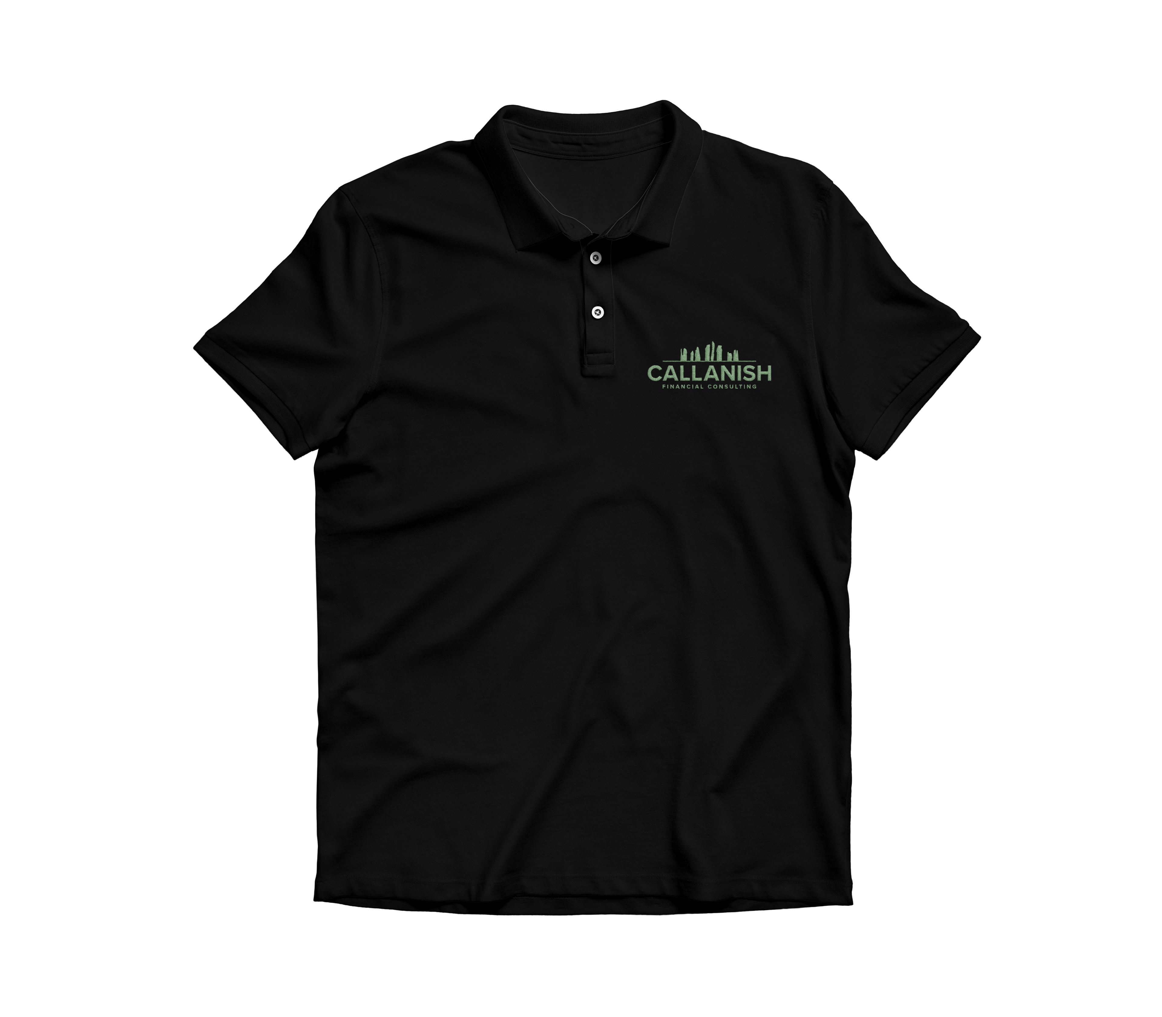
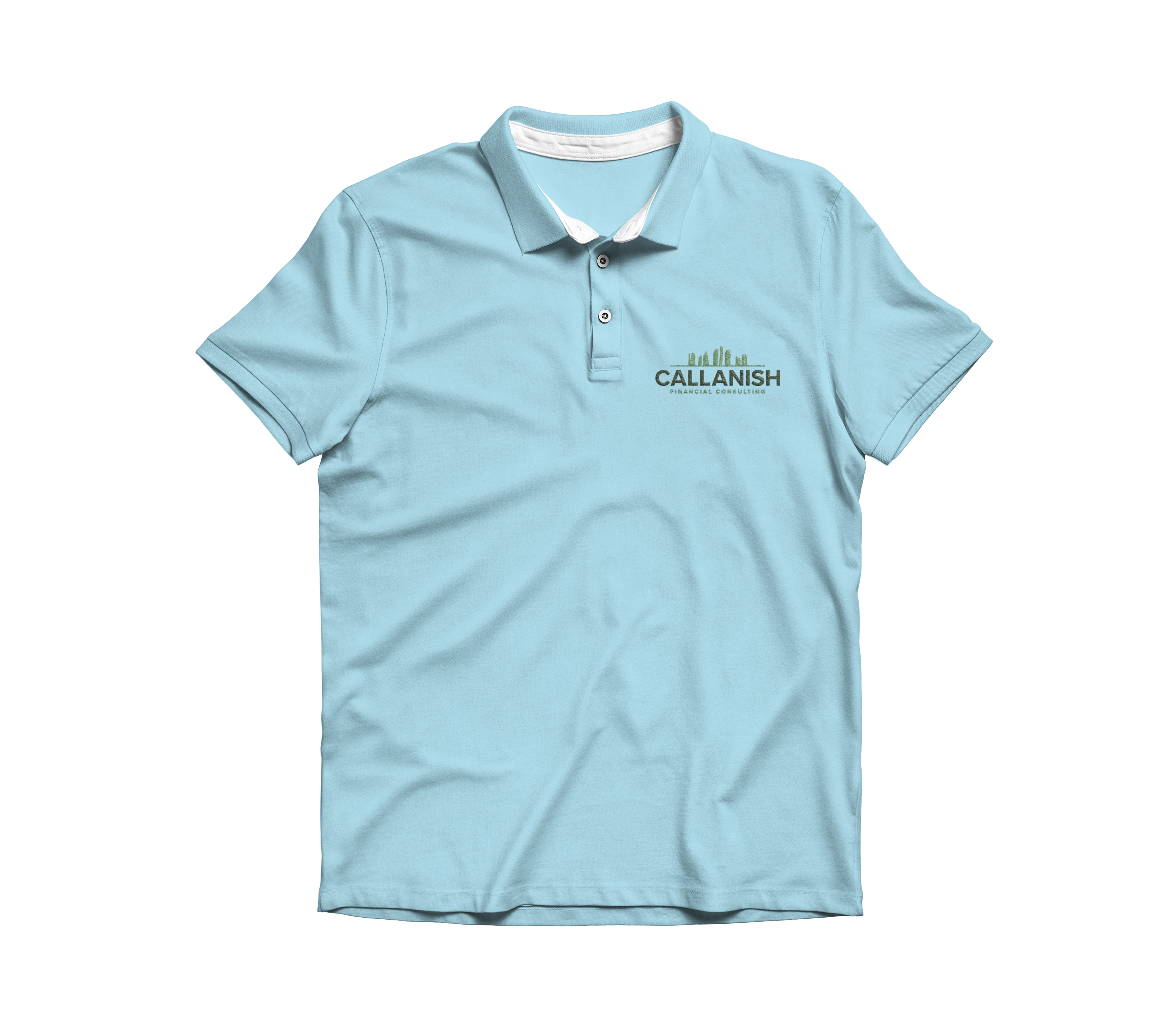
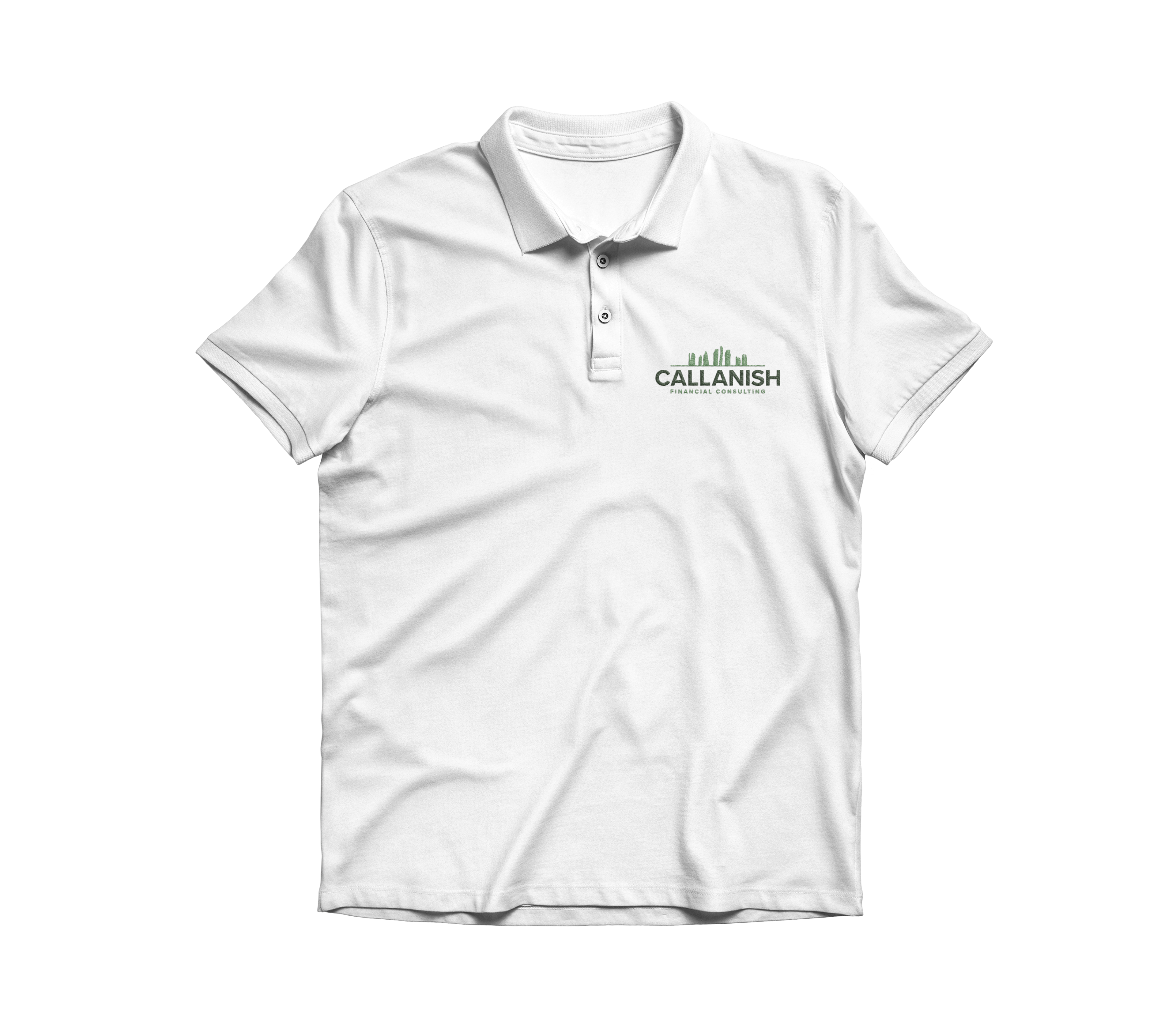
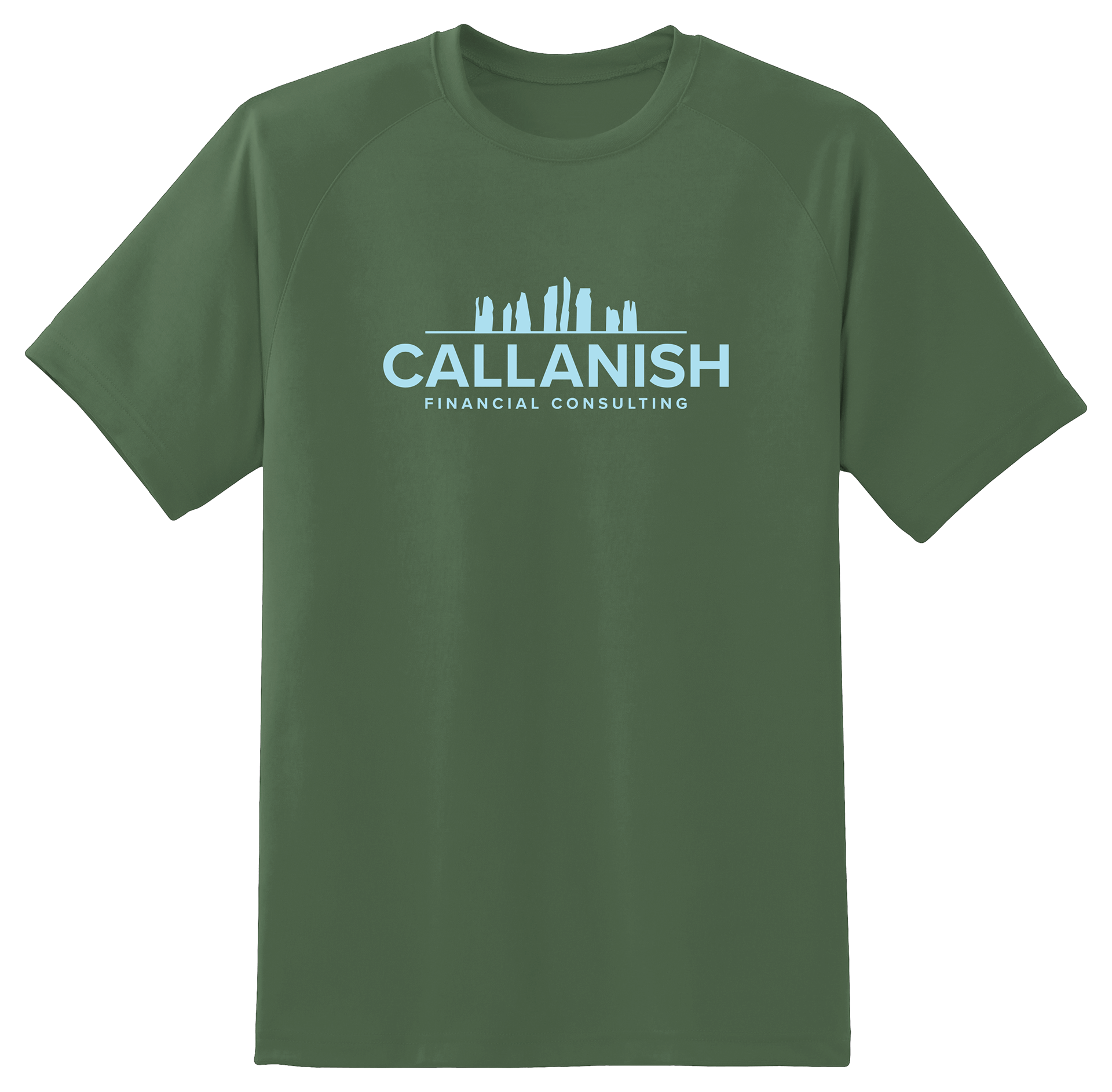
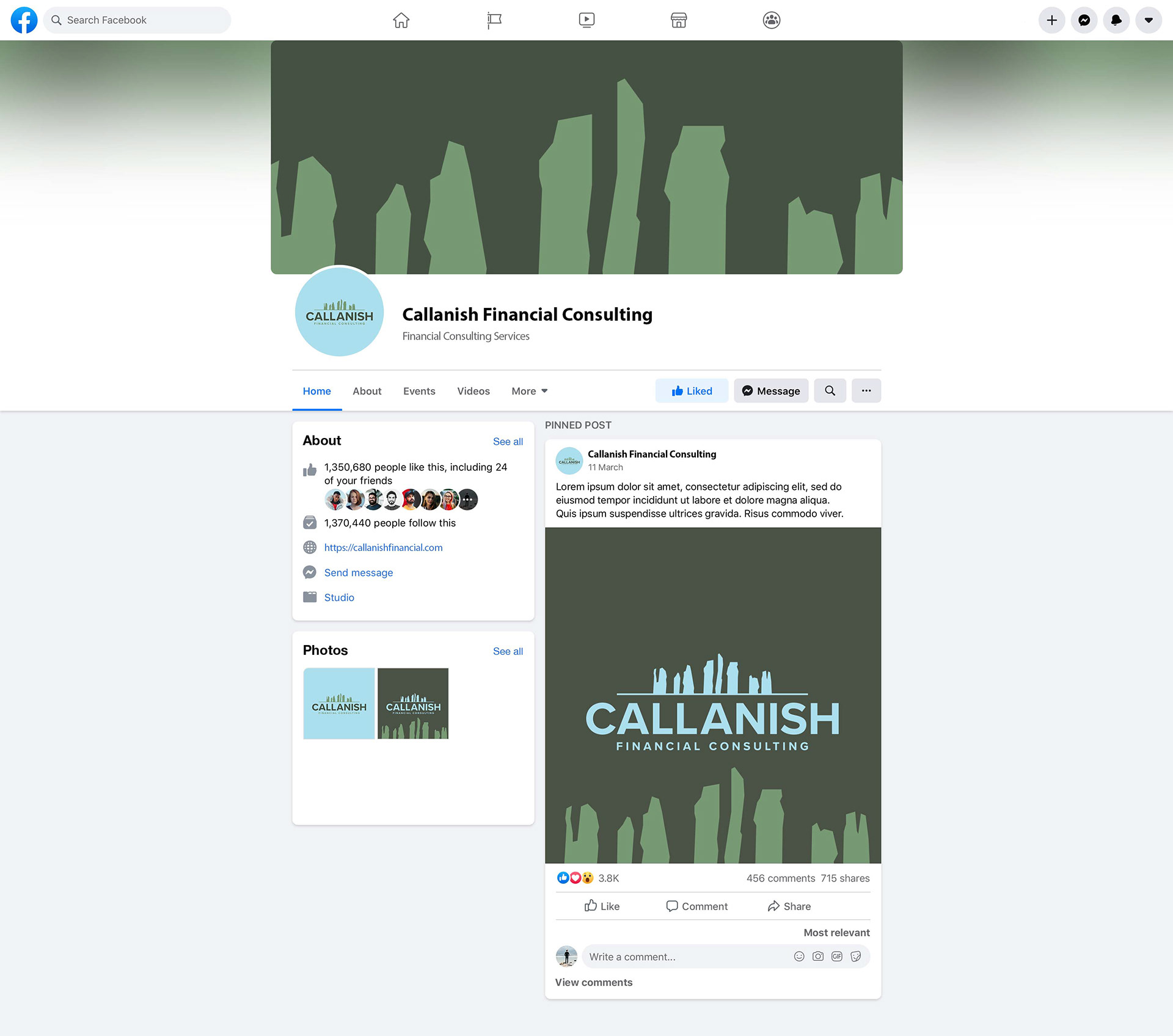
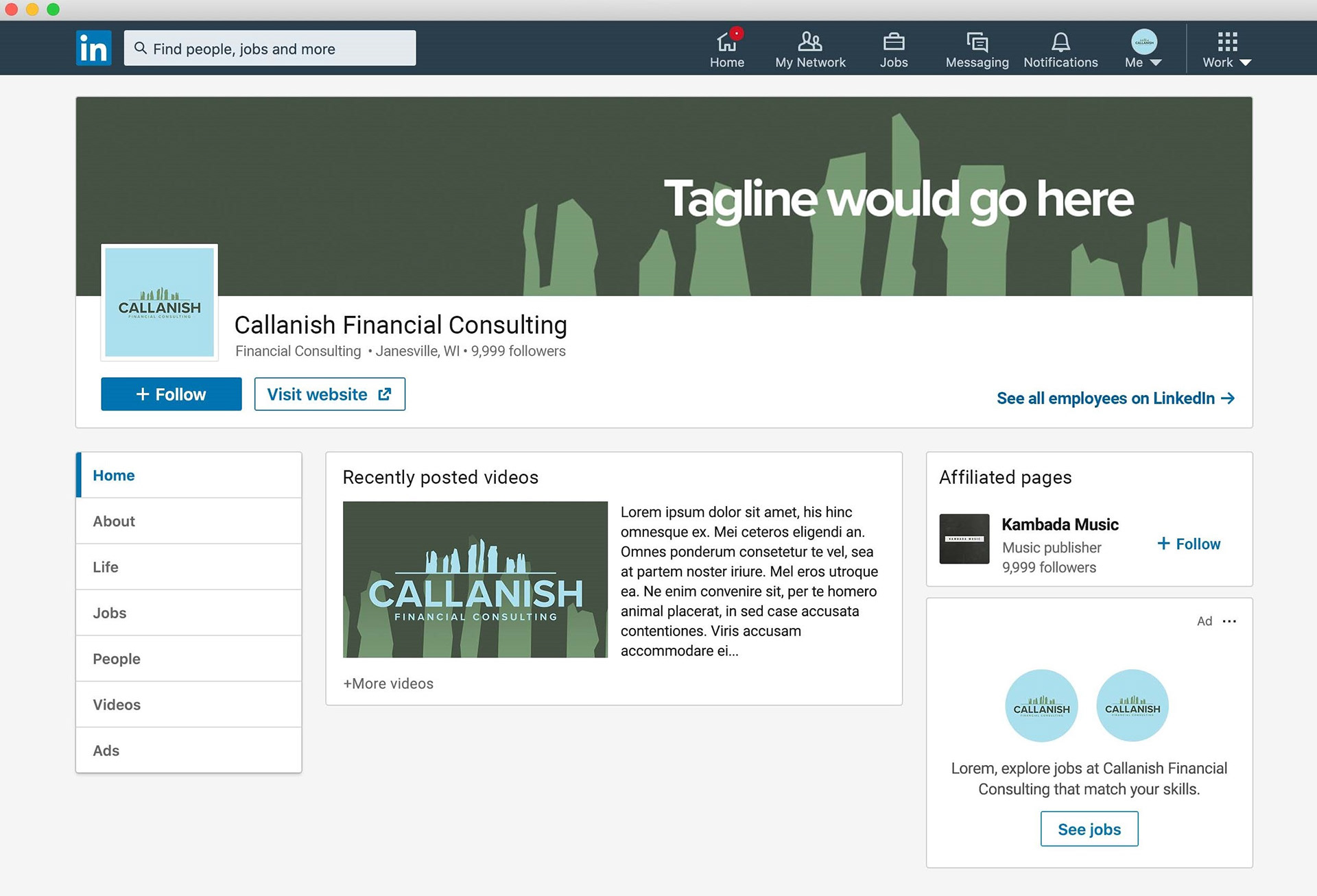
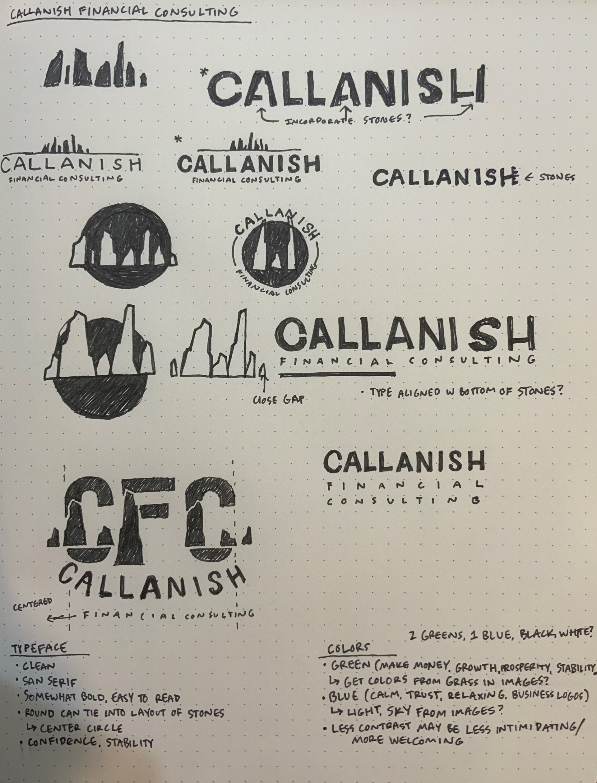
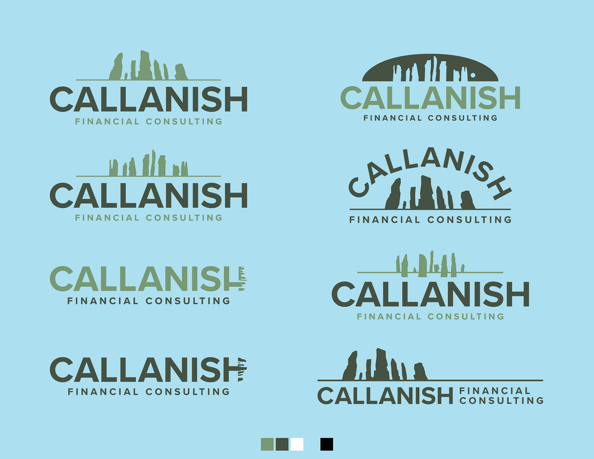
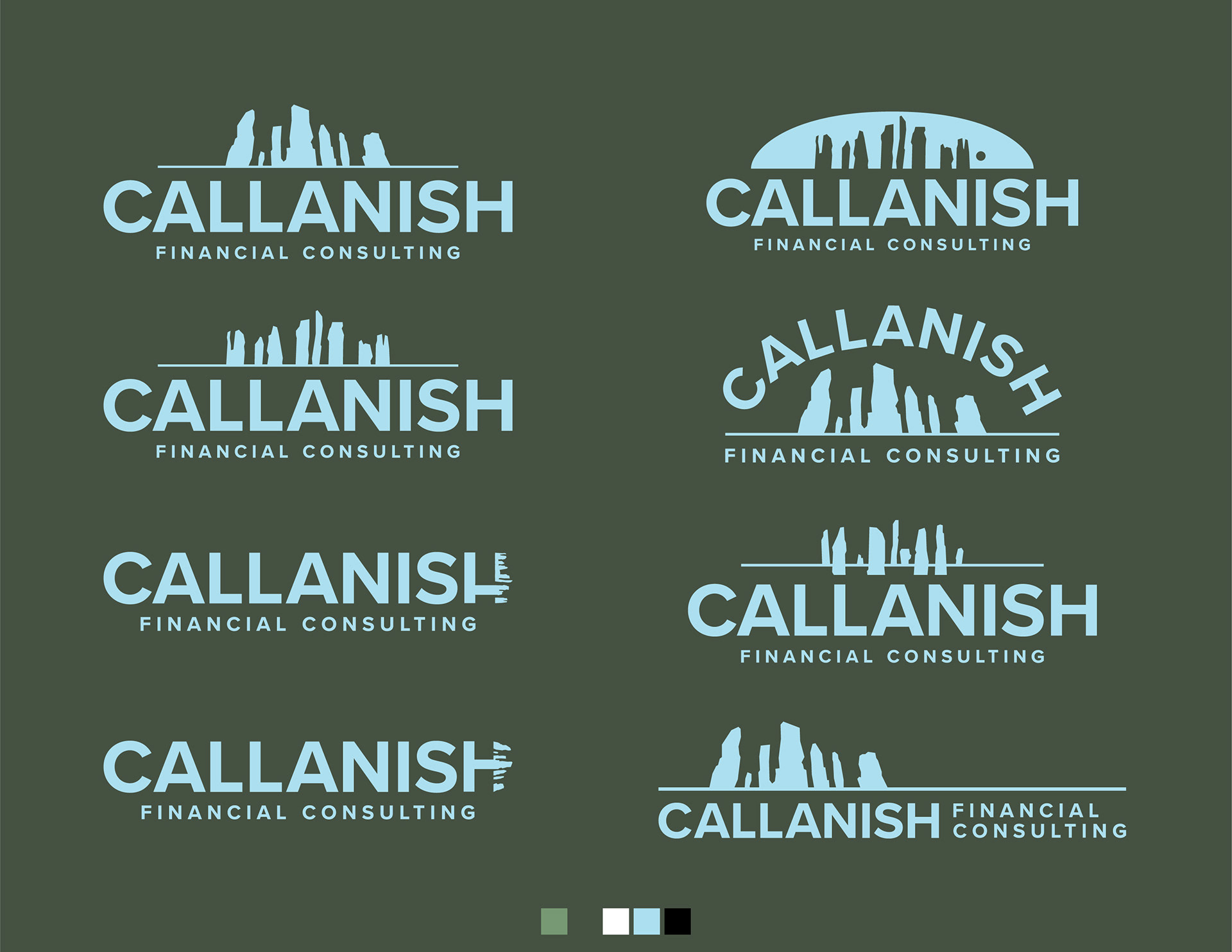
Callanish Financial Consulting
With the Callanish Standing Stones of Scotland as inspiration, the client wanted to create a long-lasting new identity for his financial consulting company.
The main goal was incorporating the stones with the typeface (Proxima Nova) to create a timeless and clear logo. The design is meant to provide a sense of stability and confidence to customers when they choose Callanish Financial Consulting. This was achieved through a clean, bold typeface paired with tones of greens (money, growth, prosperity) and blue (calm, trust, relaxing). Overall, the Callanish Financial Consulting logo has the ability to be used for a variety of different purposes. It remains legible when resized for social images, as well as apparel. The logo will also be able to be placed on letterhead, envelopes, and business cards in the future.
Logo Development

Mockups